Titanium.UI.TabGroup
A tabbed group of windows.
| Android | iOS |
|---|---|
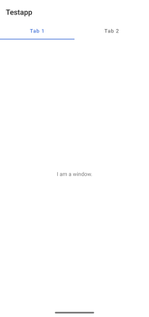 |
A tab group can contain one or more Tab objects, each of which has an associated tab control that is used to bring it into focus.
Use the Titanium.UI.createTabGroup method or <TabGroup> Alloy element to create a tab group that, in turn, contains one or more <Tab> elements.
You can add tabs to the group using addTab, and programmatically switch to a specific tab using setActiveTab.
Platform Implementation Notes
When using a tab group, note the following differences between platforms:
The tab group controls are positioned at the top of the display on Android and at the bottom on iOS.
On Android, only one tab group may exist at one time. A tab group may be closed to allow a new one to be opened later, but the root of the application must be a heavyweight window to prevent it exiting. Tabs cannot be removed from the tab group once added, and tabs cannot be reordered.
If you use a BottomNavigation on Android with a Material 3 theme you should set
experimental:true.On iOS, more than one tab group may exist, and may be opened and closed as required. Each tab can contain a stack of windows, and the user can switch between them by tapping the tab's associated control. Tabs can be removed, and the user may (optionally) be allowed to reorder tabs.
On iOS, it is also possible to add tabs by updating the tabs property, and to switch active tabs by setting the active property on one of the tabs to
true. Since these mechanisms are platform-specific, it is recommended that you useaddTabandsetActiveTabinstead.If you use the iOS-specific mechanisms, it is possible to add multiple active tabs to a tab group. In this case, the result of which tab is initially selected is undefined.
Further Reading
If using tab groups on iOS, see iOS UI Element Usage Guidelines.
Extends: Titanium.UI.Window · Since: 0.9
Properties #
accessibilityDisableLongPress#
Type: Boolean
Boolean value to remove the long press notification for the device's accessibility service.
Will disable the "double tap and hold for long press" message when selecting an item.
activeTabIconTint (deprecated)#
Type: String, Titanium.UI.Color
Color applied to active tabs icons, as a color name or hex triplet, where the tab's activeIcon was not defined.
For information about color values, see the "Colors" section of Titanium.UI.
activeTintColor#
Type: String
The activeTintColor to apply to tabs.
This property affects the tint of selected tab icons.
activeTitleColor#
Type: String, Titanium.UI.Color
Defines the color of the title of tab when it's active.
The color of the title of the tab when it's active.
activity#
Type: Titanium.Android.Activity
Reference to the Android Activity object associated with this tab group.
An Activity object is not created until the tab group opens.
Before the tab group opens, activity refers to an empty JavaScript object.
You can set properties on this object but cannot invoke any Activity methods on it.
Once the tab group opens, the actual Activity object is created,
using any properties set on the JavaScript object. At this point, you can call methods
on the activity and access any properties that are set when the activity is created.
Prior to Release 3.4.0, you can only set properties on the activity after the tab group
opens.
activityEnterTransition#
Type: Number
The type of transition used when activity is entering.
Activity B's enter transition determines how views in B are animated when A starts B.
Applicable for Android 5.0 and above. This transition property will be ignored if animated is set to false.
Will also be ignored unless at least 1 view has been assigned to the addSharedElement() method,
except on Titanium 8.0.1 and higher where shared elements are no longer required to do transitions.
See "Material design activity transitions in Android" in the main description of Titanium.UI.Window
for more information.
activityExitTransition#
Type: Number
The type of transition used when activity is exiting.
Activity A's exit transition determines how views in A are animated when A starts B.
Applicable for Android 5.0 and above. This transition property will be ignored if animated is set to false.
Will also be ignored unless at least 1 view has been assigned to the addSharedElement() method,
except on Titanium 8.0.1 and higher where shared elements are no longer required to do transitions.
See "Material design activity transitions in Android" in the main description of Titanium.UI.Window
for more information.
activityReenterTransition#
Type: Number
The type of transition used when reentering to a previously started activity.
Activity A's reenter transition determines how views in A are animated when B returns to A.
Applicable for Android 5.0 and above. This transition property will be ignored if animated is set to false.
Will also be ignored unless at least 1 view has been assigned to the addSharedElement() method,
except on Titanium 8.0.1 and higher where shared elements are no longer required to do transitions.
See "Material design activity transitions in Android" in the main description of Titanium.UI.Window
for more information.
activityReturnTransition#
Type: Number
The type of transition used when returning from a previously started activity.
Activity B's return transition determines how views in B are animated when B returns to A.
Applicable for Android 5.0 and above. This transition property will be ignored if animated is set to false.
Will also be ignored unless at least 1 view has been assigned to the addSharedElement() method,
except on Titanium 8.0.1 and higher where shared elements are no longer required to do transitions.
See "Material design activity transitions in Android" in the main description of Titanium.UI.Window
for more information.
activitySharedElementEnterTransition#
Type: Number
The type of enter transition used when animating shared elements between two activities.
Activity B's shared element enter transition determines how shared elements animate from A to B.
Applicable for Android 5.0 and above. This value will be ignored if animated is set to false.
See "Material design activity transitions in Android" in the main description of Titanium.UI.Window
for more information.
activitySharedElementExitTransition#
Type: Number
The type of exit transition used when animating shared elements between two activities.
Activity A's shared element exit transition animates shared elements before they transition from A to B
Applicable for Android 5.0 and above. This value will be ignored if animated is set to false.
See "Material design activity transitions in Android" in the main description of Titanium.UI.Window
for more information.
activitySharedElementReenterTransition#
Type: Number
The type of reenter transition used when animating shared elements between two activities.
Activity A's shared element reenter transition animates shared elements after they have transitioned from B to A.
Applicable for Android 5.0 and above. This value will be ignored if animated is set to false.
See "Material design activity transitions in Android" in the main description of Titanium.UI.Window
for more information.
activitySharedElementReturnTransition#
Type: Number
The type of return transition used when animating shared elements between two activities.
Activity B's shared element return transition determines how shared elements animate from B to A.
Applicable for Android 5.0 and above. This value will be ignored if animated is set to false.
See "Material design activity transitions in Android" in the main description of Titanium.UI.Window
for more information.
allowUserCustomization#
Type: Boolean
Allow the user to reorder tabs in the tab group using the Edit button on the More
tab.
Set to false to prevent tab reordering.
apiName#
Type: String
The name of the API that this proxy corresponds to.
The value of this property is the fully qualified name of the API. For example, Button
returns Ti.UI.Button.
autoAdjustScrollViewInsets#
Type: Boolean
Specifies whether or not the view controller should automatically adjust its scroll view insets.
When the value is true, it allows the view controller to adjust its scroll view insets in response
to the screen areas consumed by the status bar, navigation bar, toolbar and tab bar.
The default behavior assumes that this is false. Must be specified before opening the window.
autoTabTitle#
Type: Boolean
If set to true it will automatically set the actionbar title to the current tabs window title.
backButtonTitle#
Type: String
Title for the back button. This is only valid when the window is a child of a tab.
backButtonTitleImage#
Type: String, Titanium.Blob
The image to show as the back button. This is only valid when the window is a child of a tab.
backgroundColor#
Type: String, Titanium.UI.Color
Background color of the window, as a color name or hex triplet.
On Android, to specify a semi-transparent background, set the alpha value using the
opacity property before opening the window.
For information about color values, see the "Colors" section of Titanium.UI.
barColor#
Type: String, Titanium.UI.Color
Default navigation bar color (typically for the More tab), as a color name or hex triplet.
For information about color values, see the "Colors" section of Titanium.UI.
A value of transparent results in a semi-opaque black bar style.
barImage#
Type: String
Background image for the nav bar, specified as a URL to a local image.
The behavior of this API on iOS has changed from version 3.2.0. Previous versions
of the SDK created a custom image view and inserted it as a child of the navigation bar.
The Titanium SDK now uses the native call to set the background image of the navigation bar.
You can set it to a 1px transparent png to use a combination of barColor and hideShadow:true.
bottomAccessoryView#
Type: Titanium.UI.View
View shown as a bottom accessory attached to the tab group.
Adds a custom view as a bottom accessory of the tab group. Available on iOS 26+ only (uses the new iOS tab group accessories).
Note: Label subviews require explicit width and height set to render properly. Be sure to set width and height on any Ti.UI.Label added to this view.
bubbleParent#
Type: Boolean
Indicates if the proxy will bubble an event to its parent.
Some proxies (most commonly views) have a relationship to other proxies, often
established by the add() method. For example, for a button added to a window, a
click event on the button would bubble up to the window. Other common parents are
table sections to their rows, table views to their sections, and scrollable views
to their views. Set this property to false to disable the bubbling to the proxy's parent.
center#
Type: Point
View's center position, in the parent view's coordinates.
This is an input property for specifying where the view should be positioned, and does not
represent the view's calculated position.
Defaults to undefined.
clipMode#
Type: Number
View's clipping behavior.
Setting this to Titanium.UI.iOS.CLIP_MODE_ENABLED enforces all child views to be clipped to this views bounds.
Setting this to Titanium.UI.iOS.CLIP_MODE_DISABLED allows child views to be drawn outside the bounds of this view.
When set to Titanium.UI.iOS.CLIP_MODE_DEFAULT or when this property is not set, clipping behavior is inferred.
See section on iOS Clipping Behavior in Titanium.UI.View.
Defaults to undefined. Behaves as if set to Titanium.UI.iOS.CLIP_MODE_DEFAULT.
elevation#
Type: Number
Base elevation of the view relative to its parent in pixels.
The elevation of a view determines the appearance of its shadow.
Higher elevations produce larger and softer shadows.
Note: The elevation property only works on Titanium.UI.View objects.
Many Android components have a default elevation that cannot be modified.
For more information, see
Google design guidelines: Elevation and shadows.
enabled#
Type: Number
Enables or disables the menu in a BottomNavigation. If disabled you can't change to a different tab.
exitOnClose#
Type: Boolean
Boolean value indicating if the application should exit when closing the tab group, whether via Android
back button or the close method.
Starting in 3.4.2 you can set this property at any time. In earlier releases you can only set this as a createTabGroup({...}) option.
experimental#
Type: Boolean
Only used for a BottomNavigation setup. If set to true it will use an optimized BottomNavigation
setup with fixes for Material 3 layouts and new properties: indicatorColor and iconFamily.
The new BottomNavigation will only load the active Activity and doesn't support swipeable.
extendEdges#
Type: Array<Number>
An array of supported values specified using the EXTEND_EDGE constants in Titanium.UI.
This is only valid for windows hosted by navigation controllers or tab bar controllers. This property is used to
determine the layout of the window within its parent view controller. For example if the window is specified to extend its top edge
and it is hosted in a navigation controller, then the top edge of the window is extended underneath the navigation bar so that part
of the window is obscured. If the navigation bar is opaque (translucent property on window is false), then the top edge of the window
will only extend if Titanium.UI.Window.includeOpaqueBars is set to true.
The default behavior is to assume that no edges are to be extended. Must be specified before opening the window.
extendSafeArea#
Type: Boolean
Specifies whether the screen insets/notches are allowed to overlap the window's content or not.
If set true, then the contents of the window will be extended to fill the whole screen and allow the
system's UI elements (such as a translucent status-bar) and physical obstructions (such as the iPhone X
rounded corners and top sensor housing) to overlap the window's content. In this case, it is the app
developer's responsibility to position views so that they're unobstructed. On Android, you can use the
Window.safeAreaPadding property after the window has been opened to
layout your content within the insets.
If set false, then the window's content will be laid out within the safe-area and its child views will be
unobstructed. For example, you will not need to position a view below the top status-bar.
Read more about the safe-area layout-guide in the Human Interface Guidelines.
filterTouchesWhenObscured#
Type: Boolean
Discards touch related events if another app's system overlay covers the view.
This is a security feature to protect an app from "tapjacking", where a malicious app can use a
system overlay to intercept touch events in your app or to trick the end-user to tap on UI
in your app intended for the overlay.
Setting this property to true causes touch related events (including "click") to not be fired
if a system overlay overlaps the view.
flags#
Type: Number
Additional flags to set on the TabGroup.
Use Titanium.UI.Android.STATUS_BAR_LIGHT to set the status bar text color to light mode.
flagSecure#
Type: Boolean
Treat the content of the window as secure, preventing it from appearing in screenshots or from being viewed on non-secure displays.
When the value is true, preventing it from appearing in screenshots or from being viewed on non-secure displays.
forceBottomPosition#
Type: Boolean
Force tab bar to bottom position.
A new floating tab bar was introduced in iPadOS 18.
It is displayed without tab icons and at the top of the screen.
This property forces the tab bar to be displayed in the old style with icons and at the bottom of the screen (as on iPhone).
fullscreen#
Type: Boolean
Boolean value indicating if the window is fullscreen.
A fullscreen window occupies all of the screen space, hiding the status bar. Must be specified
at creation time or in the options dictionary passed to the Window.open method.
On iOS the behavior of this property has changed. Starting from 3.1.3, if this property is undefined
then the property is set to the value for UIStatusBarHidden defined in tiapp.xml.
If that is not defined it is treated as explicit false. On earlier versions, opening a window with this property
undefined would not effect the status bar appearance.
hiddenBehavior#
Type: Number
Sets the behavior when hiding an object to release or keep the free space
If setting hiddenBehavior to Titanium.UI.HIDDEN_BEHAVIOR_GONE it will automatically release the space the view occupied.
For example: in a vertical layout the views below the object will move up when you hide
an object with hiddenBehavior:Titanium.UI.HIDDEN_BEHAVIOR_GONE.
- Titanium.UI.HIDDEN_BEHAVIOR_INVISIBLE. Keeps the space and just hides the object (default).
- Titanium.UI.HIDDEN_BEHAVIOR_GONE. Releases the space and hides the object.
Defaults to Titanium.UI.HIDDEN_BEHAVIOR_INVISIBLE.
hidesBackButton#
Type: Boolean
Set this to true to hide the back button of navigation bar.
When this property is set to true, the navigation window hides its back button.
hidesBarsOnSwipe#
Type: Boolean
Set this to true to hide the navigation bar on swipe.
When this property is set to true, an upward swipe hides the navigation bar and toolbar.
A downward swipe shows both bars again. If the toolbar does not have any items, it remains
visible even after a swipe.
hidesBarsOnTap#
Type: Boolean
Set this to true to hide the navigation bar on tap.
When the value of this property is true, the navigation controller toggles the hiding and
showing of its navigation bar and toolbar in response to an otherwise unhandled tap
in the content area.
hidesBarsWhenKeyboardAppears#
Type: Boolean
Set this to true to hide the navigation bar when the keyboard appears.
When this property is set to true, the appearance of the keyboard causes the
navigation controller to hide its navigation bar and toolbar.
hideShadow#
Type: Boolean
Set this to true to hide the shadow image of the navigation bar.
This property is only honored if a valid value is specified for the barImage property.
hidesSearchBarWhenScrolling#
Type: Boolean
A Boolean value indicating whether the integrated search bar is hidden when scrolling any underlying content.
When the value of this property is true, the search bar is visible only when the scroll position
equals the top of your content view. When the user scrolls down, the search bar collapses into
the navigation bar. Scrolling back to the top reveals the search bar again. When the value of
this property is false, the search bar remains regardless of the current scroll position.
You must set Titanium.UI.ListView.showSearchBarInNavBar or Titanium.UI.TableView.showSearchBarInNavBar
property for this property to have any effect.
homeIndicatorAutoHidden#
Type: Boolean
Boolean value indicating whether the system is allowed to hide the visual indicator for returning to the Home screen.
Set this value true, if you want the system to determine when to hide the indicator. Set this value false,
if you want the indicator shown at all times. The system takes your preference into account, but setting
true is no guarantee that the indicator will be hidden.
horizontalMotionEffect#
Type: MinMaxOptions
Adds a horizontal parallax effect to the view
Note that the parallax effect only happens by tilting the device so results can not be seen on Simulator.
To clear all motion effects, use the Titanium.UI.clearMotionEffects method.
id#
Type: String
View's identifier.
The id property of the Ti.UI.View represents the view's identifier. The identifier string does
not have to be unique. You can use this property with Titanium.UI.View.getViewById method.
includeOpaqueBars#
Type: Boolean
Specifies if the edges should extend beyond opaque bars (navigation bar, tab bar, toolbar).
By default edges are only extended to include translucent bars. However if this is set to true, then edges are extended beyond
opaque bars as well.
The default behavior assumes that this is false. Must be specified before opening the window.
interactiveDismissModeEnabled (deprecated)#
Type: Boolean
A boolean indicating whether or not child windows of this tab group
should have the ability to be swipe-to-closed over the full width of it's window or not.
keepHardwareMode#
Type: Boolean
A value indicating the render mode of the View
Set to true to keep hardware mode when using a border and transparent backgrounds.
keepScreenOn#
Type: Boolean
Determines whether to keep the device screen on.
When true the screen will not power down. Note: enabling this feature will use more
power, thereby adversely affecting run time when on battery.
For iOS look at Titanium.App.idleTimerDisabled.
largeTitleDisplayMode#
Type: Number
The mode to use when displaying the title of the navigation bar.
Automatically use the large out-of-line title based on the state of the
previous item in the navigation bar. An item with
largeTitleDisplayMode = Ti.UI.iOS.LARGE_TITLE_DISPLAY_MODE_AUTOMATIC
will show or hide the large title based on the request of the previous
navigation item. If the first item pushed is set to Automatic, then it
will show the large title if the navigation bar has largeTitleEnabled = true.
largeTitleEnabled#
Type: Boolean
A Boolean value indicating whether the title should be displayed in a large format.
When set to true, the navigation bar will use a larger out-of-line
title view when requested by the current navigation item. To specify when
the large out-of-line title view appears, see Titanium.UI.Window.largeTitleDisplayMode.
leftNavButton#
Type: Titanium.UI.View
View to show in the left nav bar area.
In an Alloy application you can specify this property with a <LeftNavButton> element inside the
<Window> element, for example:
<Alloy>
    <TabGroup>
        <Tab>
            <Window class="container">
                <LeftNavButton platform=ios>
                    <Button title="Back" onClick="closeWindow" />
                </LeftNavButton>
            </Window>
        </Tab>
    </TabGroup>
</Alloy>
leftNavButtons#
Type: Array<Titanium.UI.View>
An Array of views to show in the left nav bar area.
lifecycleContainer#
Type: Titanium.UI.Window, Titanium.UI.TabGroup
The Window or TabGroup whose Activity lifecycle should be triggered on the proxy.
If this property is set to a Window or TabGroup, then the corresponding Activity lifecycle event callbacks
will also be called on the proxy. Proxies that require the activity lifecycle will need this property set
to the appropriate containing Window or TabGroup.
modal#
Type: Boolean
Indicates to open a modal window or not.
Set to true to create a modal window.
Must be specified at creation time or in the dictionary passed to the
Window.open method.
In the user interface, a modal window is a window that blocks the main application UI until
the modal window is dismissed. A modal window requires the user to interact with it to
resume the normal flow of the application.
See the "Modal Windows" section for platform-specific information.
navBarHidden#
Type: Boolean
Hides the navigation bar (true) or shows the navigation bar (false).
iOS Platform Notes
Since Titanium SDK 6.0.0, you can use this property to hide and show the property as well.
Using this property, the navigation bar will be hidden or shown animated by default. Please note that
this property will only take effect if the window is used inside a Titanium.UI.NavigationWindow
and will be ignored otherwise. If you want to hide or show the navigation without an animation, use t
he methods Titanium.UI.Window.showNavBar and Titanium.UI.Window.hideNavBar with the second parameter
to specify the animation:
// "myWindow" is a Ti.UI.Window inside a Ti.UI.NavigationWindow
myWindow.hideNavBar(true, {animated: false});
Android Platform Notes
Since Release 3.3.0, due to changes to support the appcompat library, this property has no
effect. By default, the action bar is always displayed. To hide the action bar, see the
Android Action Bar guide.
navigationWindow#
Type: Titanium.UI.NavigationWindow
The Titanium.UI.NavigationWindow instance hosting this window.
Returns the navigation window that hosts this window. Returns null if the window is not
hosted by a navigation window.
navTintColor#
Type: String, Titanium.UI.Color
The tintColor to apply to the navigation bar (typically for the More tab).
This property is a direct correspondent of the tintColor property of NavigationBar on iOS.
onBack#
Type: Callback<void>
Callback function that overrides the default behavior when the user presses the Back
button.
This was separated from the Titanium.UI.Window.androidback event. You need to define this
callback if you explicitly want to override the back button behavior.
orientation#
Type: Number
Current orientation of the window.
To determine the current orientation of the device, see
Gesture.orientation, instead.
See
the discussion of the orientationModes
property for more information on how the screen orientation is determined.
orientationModes#
Type: Array<Number>
Array of supported orientation modes, specified using the orientation
constants defined in Titanium.UI.
Note: Using the orientationModes property to force the orientation of non-modal
windows is considered a bad practice and will not be supported, including forcing the
orientation of windows inside a NavigationWindow or TabGroup.
To restrict this window to a certain set of orientations, specify one or more
of the orientation constants LANDSCAPE_LEFT,
LANDSCAPE_RIGHT, PORTRAIT,
UPSIDE_PORTRAIT.
orientationModes must be set before opening the window.
To determine the current orientation of the window, see
Window.orientation.
To determine the current orientation of the device, see
Gesture.orientation.
To be notified when the device's current orientation changes, add a listener for the
Titanium.Gesture.orientationchange event.
Android Orientation Modes
On Android, orientation behavior is dependent on the Android SDK level
of the device itself. Devices running Android 2.3 and above support "sensor portrait
mode" and "sensor landscape mode," in these modes, the device is locked into
either a portrait or landscape orientation, but can switch between the normal and reverse
orientations (for example, between PORTRAIT and UPSIDE_PORTRAIT).
In addition, the definition of portrait or
landscape mode can vary based on the physical design of the device. For example,
on some devices Titanium.UI.LANDSCAPE_LEFT represents the top of the device being at
the 270 degree position but other devices may (based on camera position for example)
treat this position as Titanium.UI.LANDSCAPE_RIGHT. In general, applications for
Android that need to be aware of orientation should try and limit their orientation
logic to handling either portrait or landscape rather than worrying about the reverse
modes. This approach will allow the orientation modes to adopt a more natural feel for
the specific device.
The following list breaks down the orientation behavior on Android based on the contents
of the orientationModes array:
-
Empty array. Enables orientation to be fully controlled by the device sensor.
-
Array includes one or both portrait modes and one or both landscape modes.
Enables full sensor control (identical to an empty array). -
Array contains PORTRAIT and UPSIDE_PORTRAIT. On Android 2.3 and above,
enables sensor portrait mode. This means the screen will shift between
both portrait modes according to the sensor inside the device.On Android versions below 2.3, locks screen orientation in normal portrait mode.
-
Array contains LANDSCAPE_LEFT and LANDSCAPE_RIGHT. On Android 2.3 and above,
enables sensor landscape mode. This means the screen will shift between both
landscape modes according to the sensor inside the device.On Android versions below 2.3, locks screen orientation in normal landscape mode.
-
Array contains only PORTRAIT. Locks screen orientation
to normal portrait mode. -
Array contains only LANDSCAPE_LEFT. Locks screen
orientation to normal landscape mode. -
Array contains only UPSIDE_PORTRAIT. On
Android 2.3 and above, locks screen in reverse portrait mode.On Android versions below 2.3, results are undefined.
-
Array contains only LANDSCAPE_RIGHT. On
Android 2.3 and above, locks screen in reverse landscape mode.On Android versions below 2.3, results are undefined.
overrideCurrentAnimation#
Type: Boolean
When on, animate call overrides current animation if applicable.
If this property is set to false, the animate call is ignored if the view is currently being animated.
Defaults to undefined but behaves as false
paddingBottom#
Type: Number, String
Bottom padding of bottom navigation
When using TABS_STYLE_BOTTOM_NAVIGATION you can set the padding to have
a floating bottom navigation
paddingLeft#
Type: Number, String
Left padding of bottom navigation
When using TABS_STYLE_BOTTOM_NAVIGATION you can set the padding to have
a floating bottom navigation
paddingRight#
Type: Number, String
Right padding of bottom navigation
When using TABS_STYLE_BOTTOM_NAVIGATION you can set the padding to have
a floating bottom navigation
previewContext#
Type: Titanium.UI.iOS.PreviewContext
The preview context used in the 3D-Touch feature "Peek and Pop".
Preview context to present the "Peek and Pop" of a view. Use an configured instance
of Titanium.UI.iOS.PreviewContext here.
Note: This property can only be used on devices running iOS 9 or later and supporting 3D-Touch.
It is ignored on older devices and can manually be checked using Titanium.UI.iOS.forceTouchSupported.
pullBackgroundColor#
Type: String, Titanium.UI.Color
Background color of the wrapper view when this view is used as either Titanium.UI.ListView.pullView or Titanium.UI.TableView.headerPullView.
Defaults to undefined. Results in a light grey background color on the wrapper view.
rect#
Type: DimensionWithAbsolutes
The bounding box of the view relative to its parent, in system units.
The view's bounding box is defined by its size and position.
The view's size is rect.width x rect.height. The view's top-left position relative to
its parent is (rect.x , rect.y).
On Android it will also return rect.absoluteX and 'rect.absoluteY' which are relative to
the main window.
The correct values will only be available when layout is complete.
To determine when layout is complete, add a listener for the
postlayout event.
rightNavButton#
Type: Titanium.UI.View
View to show in the right nav bar area.
In an Alloy application you can specify this property with a <RightNavButton> element in the
<Window> element, for example:
<Alloy>
    <TabGroup>
        <Tab>
            <Window class="container">
                <RightNavButton platform=ios>
                    <Button title="Back" onClick="closeWindow" />
                </RightNavButton>
            </Window>
        </Tab>
    </TabGroup>
</Alloy>
rightNavButtons#
Type: Array<Titanium.UI.View>
An Array of views to show in the right nav bar area.
rotation#
Type: Number
Clockwise 2D rotation of the view in degrees.
Translation values are applied to the static post layout value.
rotationX#
Type: Number
Clockwise rotation of the view in degrees (x-axis).
Translation values are applied to the static post layout value.
rotationY#
Type: Number
Clockwise rotation of the view in degrees (y-axis).
Translation values are applied to the static post layout value.
safeAreaPadding#
Type: Padding
The padding needed to safely display content without it being overlapped by the screen insets and notches.
When setting Window.extendSafeArea to true, the system's insets
such as a translucent status bar, translucent navigation bar, and/or camera notches will be allowed to
overlay on top of the window's content. In this case, it is the app developer's responsibility to
prevent these insets from overlapping key content such as buttons. This property provides the amount of
space needed to be added to the left, top, right, and bottom edges of the window root view to do this.
This property won't return values greater than zero until the window has been opened. It is recommended
that you read this property via a Titanium.UI.View.postlayout event listener since the padding values can
change when when the app's orientation changes or when showing/hiding the action bar.
If the Window.extendSafeArea property is set false, then the
returned padding will be all zeros since the root content will be positioned between all insets.
Below is an example on how to set up a safe-area view container using this property.
// Set up a window with a translucent top status bar and translucent nav bar.
// This will only work on Android 4.4 and newer OS versions.
var win = Ti.UI.createWindow({
    extendSafeArea: true,
    theme: 'Theme.Titanium.NoTitleBar',
    windowFlags: Ti.UI.Android.FLAG_TRANSLUCENT_NAVIGATION | Ti.UI.Android.FLAG_TRANSLUCENT_STATUS
});

// Set up a safe-area view to be laid out between the system insets.
// You should use this as a container for child views.
var safeAreaView = Ti.UI.createView({
    backgroundColor: 'green'
});
win.add(safeAreaView);
win.addEventListener('postlayout', function() {
    // Update the safe-area view's dimensions after every 'postlayout' event.
    safeAreaView.applyProperties(win.safeAreaPadding);
});

// Open the window.
win.open();
scaleX#
Type: Number
Scaling of the view in x-axis in pixels.
Translation values are applied to the static post layout value.
scaleY#
Type: Number
Scaling of the view in y-axis in pixels.
Translation values are applied to the static post layout value.
shadowImage#
Type: String
Image of the shadow placed between the tab group and the content area.
The Titanium.UI.TabGroup.tabsBackgroundImage property must also be set
in order for this to take effect.
shiftMode#
Type: Number
Determines whether the TABS_STYLE_BOTTOM_NAVIGATION uses shiftMode.
In Android BottomNavigationView uses shiftMode by default. This mode changes
unselected tabs' properties - makes the title invisible and reduces the icon's
dimensions by half.
This property allows the user to choose whether they would use this design
behavior.
Default is 1 (true) to show title only when the tab is selected. Selected tab will be bigger.
Set it to 0 (false) to show all titles and make the buttons the same size.
Set it to 2 hide all titles and make the buttons the same size. Title stays hidden for active tabs.
NOTE: This property only affects TabGroups with the TABS_STYLE_BOTTOM_NAVIGATION.
size#
Type: Dimension
The size of the view in system units.
Although property returns a <Dimension> dictionary, only the width and height
properties are valid. The position properties--x and y--are always 0.
To find the position and size of the view, use the rect
property instead.
The correct values will only be available when layout is complete.
To determine when layout is complete, add a listener for the
postlayout event.
smoothScrollOnTabClick#
Type: Boolean
Boolean value indicating if changing pages by tab clicks is animated.
If true, when clicking the tab the page transition is animated, false otherwise.
splitActionBar (deprecated)#
Type: Boolean
Boolean value to enable split action bar.
splitActionBar must be set before opening the window.
This property indicates if the window should use a split action bar
statusBarStyle#
Type: Number
The status bar style associated with this window.
Sets the status bar style when this window has focus. This is now the recommended way to control the
status bar style on the application.
If this value is undefined, the value is set to UIStatusBarStyle defined in tiapp.xml.
If that is not defined it defaults to Titanium.UI.iOS.StatusBar.DEFAULT.
style#
Type: Number
Property defining which style for the TabGroup to be used.
Since 8.0.0 Titanium has introduce a new style to be used for the TabGroup component.
For backwards compatibility not taking advantage of this property results in using the default style
which is similar to the ActionBar Tabs style but sticking to the Material design Guidelines.
TABS_STYLE_BOTTOM_DEFAULT is the style that was used in Titanium
prior to 8.0.0.GA. It displays the TabGroup with a list of Tabs at the top of the screen.
TABS_STYLE_BOTTOM_NAVIGATION is a style that displays
the TabGroup with a list of Tabs in a controller at the bottom of the screen. The recommended usage of this
style is for items count between three and five: (https://material.io/design/components/bottom-navigation.html#usage)
In Android it is limited to supporting a maximum number of five tabs.
You can use paddingLeft, paddingRight, paddingBottom to create a floating bottom navigation. If you want to change the
radius or background color you'll need to create /app/platform/android/res/drawable/titanium_rounded_corners.xml and set it to
<?xml version="1.0" encoding="UTF-8"?>
<shape xmlns:android="http://schemas.android.com/apk/res/android">
    <solid android:color="#FFFFFF" />
    <corners android:radius="7dp" />
</shape>
sustainedPerformanceMode#
Type: Boolean
Maintain a sustainable level of performance.
Performance can fluctuate dramatically for long-running apps, because the system throttles
system-on-chip engines as device components reach their temperature limits. This fluctuation
presents a moving target for app developers creating high-performance, long-running apps.
Setting this feature to true will set sustained performance mode for the corresponding window.
If property is undefined then it defaults to false.
Note: This feature is only available on supported devices. The functionality is experimental and
subject to change in future releases. See Android docs for further info.
swipeable#
Type: Boolean
Boolean value indicating if tab navigation can be done by swipes, in addition to tab clicks.
On Android, the tabs may be selected by swipes, in addition to clicks. This property may be set at
tab group creation, or any time later as long as the tab navigation is not disabled.
swipeToClose#
Type: Boolean
Boolean value indicating if the user should be able to close a window using a swipe gesture.
If false the user will not be able to swipe from the left edge of the window to close it.
Note: This property is only used for a window being embedded in a Ti.UI.Tab or
Ti.UI.NavigationWindow. It is enabled by default.
tabBarHidden#
Type: Boolean
Boolean value indicating if the tab bar should be hidden.
tabBarHidden must be set before opening the window.
This property is only valid when the window is the child of a tab.
tabBarVisible#
Type: Boolean
Programmatically shows / hides the bottom tab group of the tab group.
This method also updates iOS 18+ Elevated Tab Bar on iPad.
Notes: Animation effect is applied on iOS <= 17, but will be removed in SDK 13.0.0.
tabMode#
Type: Number
Property defining which tabMode is used for the TabGroup.
Sets the style of the TabGroup tabs.
TAB_MODE_SCROLLABLE is the best style for showing long tab titles and
enables horizontal scrolling (default).
TAB_MODE_FIXED will show all tabs at once.
tabsBackgroundColor#
Type: String, Titanium.UI.Color
Default background color for inactive tabs, as a color name or hex triplet.
For information about color values, see the "Colors" section of Titanium.UI.
A tab's backgroundColor property takes precedence if set.
This property applies to all states and tabs, not just inactive tabs. Furthermore, the inactive
tab icons without activeIcon will be tinted this color.
tabsBackgroundSelectedColor#
Type: String
Default background selected color for tabs, as a color name or hex triplet.
For information about color values, see the "Colors" section of Titanium.UI.
This property is only supported by
TABS_STYLE_BOTTOM_NAVIGATION.
A tab's backgroundFocusedColor property takes
precedence if set.
tabsTintColor (deprecated)#
Type: String, Titanium.UI.Color
The tintColor to apply to the tabs.
This property is a direct correspondent of the tintColor property of UITabBar on iOS. This effects the
title and icons rendered in the active tab. When not specified the active icons are tinted with a bright
blue.
tabsTranslucent#
Type: Boolean
A Boolean value that indicates whether the tab group is translucent.
When the value of this property is true, the tab group adds a translucent effect to its background
image or tint color. When translucency is enabled, part of the tab group's underlying content is able
to show through, although the amount that shows through depends on the rest of the tab group configuration.
For example, a background image can wholly or partially obscure the background content. Setting this
property to NO causes the tab group to render its bar tint color or background image on top of an opaque backdrop.
The default value of this property is dependent on the configuration of the tab group:
- The default value is
truewhen the tab group does not have a custom background image. - The default value is
truewhen a custom background image contains any transparency - that is,
at least one pixel has an alpha value of less than 1.0. - The default value is
falsewhen the custom background image is completely opaque - that is,
all pixels have an alpha value of 1.0.
theme#
Type: String
Name of the theme to apply to the window.
Set the theme of the window. It can be either a built-in theme
or a custom theme.
tintColor#
Type: String
The tintColor to apply to tabs.
This property affects the tint of unselected tab icons.
titleAttributes#
Type: titleAttributesParams
Title text attributes of the window to be applied on the More tab.
Use this property to specify the color, font and shadow attributes of the title.
titleColor#
Type: String, Titanium.UI.Color
Defines the color of the title of tab when it's inactive.
The color of the title of the tab when it's inactive.
titleControl#
Type: Titanium.UI.View
View to show in the title area of the nav bar.
In an Alloy application you can specify this property using a <TitleControl> element inside
<Window>, for example:
<Alloy>
    <Window>
        <RightNavButton>
            <Button title="Back" />
        </RightNavButton>
        <LeftNavButton>
            <Button title="Back" />
        </LeftNavButton>
        <TitleControl>
            <View backgroundColor="blue" height="100%" width="100%"></View>
        </TitleControl>
    </Window>
</Alloy>
titleid#
Type: String
Key identifying a string from the locale file to use for the window title.
Only one of title or titleid should be specified.
titleImage#
Type: String
Image to show in the title area of the nav bar, specified as a local file path or URL.
titlepromptid#
Type: String
Key identifying a string from the locale file to use for the window title prompt.
Only one of titlePrompt or titlepromptid should be specified.
toolbar#
Type: Array<Titanium.UI.View>
Array of button objects to show in the window's toolbar.
The toolbar is only shown when the window is inside a Titanium.UI.NavigationWindow.
To display a toolbar when a window is not inside a NavigationWindow, add an instance of a
Titanium.UI.iOS.Toolbar to the window.
To customize the toolbar, use the setToolbar() method.
Since Alloy 1.6.0, you can specify this property using the <WindowToolbar> element as a
child of a <Window> element, for example:
<Alloy>
    <NavigationWindow>
        <Window>
            <WindowToolbar>
                <Button id="send" title="Send" style="Ti.UI.BUTTON_STYLE_OPTION_POSITIVE" />
                <FlexSpace/>
                <Button id="camera" systemButton="Ti.UI.iOS.SystemButton.CAMERA" />
                <FlexSpace/>
                <Button id="cancel" systemButton="Ti.UI.iOS.SystemButton.CANCEL" />
            </WindowToolbar>
        </Window>
    </NavigationWindow>
</Alloy>
tooltip#
Type: String
The default text to display in the control's tooltip.
Assigning a value to this property causes the tool tip to be displayed for the view.
Setting the property to null cancels the display of the tool tip for the view.
Note: This property is only used for apps targeting macOS Catalyst.
touchEnabled#
Type: Boolean
Determines whether view should receive touch events.
If false, will forward the events to peers.
touchFeedback#
Type: Boolean
A material design visual construct that provides an instantaneous visual confirmation of touch point.
Touch feedback is only applied to a view's background. It is never applied to the view's foreground content
such as a Titanium.UI.ImageView's image.
For Titanium versions older than 9.1.0, touch feedback only works if you set the
Titanium.UI.View.backgroundColor property to a non-transparent color.
touchFeedbackColor#
Type: String
Optional touch feedback ripple color. This has no effect unless touchFeedback is true.
Defaults to provided theme color.
transitionAnimation#
Type: Titanium.Proxy
Use a transition animation when opening or closing windows in a
Titanium.UI.NavigationWindow or Titanium.UI.Tab.
Create the transition animation using the Titanium.UI.iOS.createTransitionAnimation
method.
transitionName#
Type: String
A name to identify this view in activity transition.
Name should be unique in the View hierarchy.
translationX#
Type: Number
Horizontal location of the view relative to its left position in pixels.
Translation values are applied to the static post layout value.
translationY#
Type: Number
Vertical location of the view relative to its top position in pixels.
Translation values are applied to the static post layout value.
translationZ#
Type: Number
Depth of the view relative to its elevation in pixels.
Translation values are applied to the static post layout value.
translucent#
Type: Boolean
Boolean value indicating if the nav bar (typically for the More tab), is translucent.
uiFlags#
Type: Number
Additional UI flags to set on the Activity Window.
See WindowManager.LayoutParams for a
list of additional flags that can be assigned to this property. For example, you can use 8192 (SYSTEM_UI_FLAG_LIGHT_STATUS_BAR) to set
the status bar text color to a dark color.
unselectedItemTintColor (deprecated)#
Type: String, Titanium.UI.Color
Unselected items in this tab group will be tinted with this color. Setting this value to null
indicates that the tab group should use its default value instead.
For information about color values, see the "Colors" section of Titanium.UI.
verticalMotionEffect#
Type: MinMaxOptions
Adds a vertical parallax effect to the view
Note that the parallax effect only happens by tilting the device so results can not be seen on Simulator.
To clear all motion effects, use the Titanium.UI.clearMotionEffects method.
viewShadowColor#
Type: String, Titanium.UI.Color
Determines the color of the shadow.
iOS Defaults to undefined. Behaves as if transparent. Android default is black.
On Android you can set <item name="android:ambientShadowAlpha">0.5</item> and
<item name="android:spotShadowAlpha">0.5</item> in your theme to change the
opacity.
viewShadowOffset#
Type: Point
Determines the offset for the shadow of the view.
Defaults to undefined. Behaves as if set to (0,-3)
viewShadowRadius#
Type: Number, String
Determines the blur radius used to create the shadow.
Defaults to undefined. Behaves as if set to 3. Accepts density units as of 10.0.1.
windowFlags#
Type: Number
Additional flags to set on the Activity Window.
Sets flags such as Titanium.UI.Android.FLAG_TRANSLUCENT_NAVIGATION and
Titanium.UI.Android.FLAG_TRANSLUCENT_STATUS. When using multiple flags, you must bitwise-or them together.
See WindowManager.LayoutParams for
list of additional flags that you can assign to this property. You can assign these Java flags to this property
by using their numeric constant.
Setting Titanium.UI.Window.fullscreen to true automatically sets the WindowManager.LayoutParams.FLAG_FULLSCREEN
flag. Setting Titanium.UI.Window.flagSecure to true automatically sets the WindowManager.LayoutParams.FLAG_SECURE flag.
Use Titanium.UI.Android.STATUS_BAR_LIGHT to set the status bar text color to light mode.
windowPixelFormat#
Type: Number
Set the pixel format for the Activity's Window.
For more information on pixel formats, see
Android SDK Window.setFormat
windowSoftInputMode#
Type: Number
Determines how the tab group is treated when a soft input method (such as a virtual keyboard)
is displayed.
For more information see the official Android API Reference,
Window.setSoftInputMode.
Methods #
addEventListener #
Adds the specified callback as an event listener for the named event.
| Name | Type | Summary | Optional |
|---|---|---|---|
name | String | Name of the event. | No |
callback | Callback<Titanium.Event> | Callback function to invoke when the event is fired. | No |
addSharedElement #
Adds a common UI element to participate in window transition animation.
Available from Android 5.0. Use the current window's UI element that is contextually shared with the other window.
| Name | Type | Summary | Optional |
|---|---|---|---|
view | Titanium.UI.View | The shared view from the current window. | No |
transitionName | String | The assigned common transition name of UI elements in both windows. | No |
addTab #
Adds a tab to the tab group.
| Name | Type | Summary | Optional |
|---|---|---|---|
tab | Titanium.UI.Tab | Tab to add. | No |
animate #
Animates this view.
The Animation object or dictionary passed to this method defines
the end state for the animation, the duration of the animation, and other properties.
Note that on SDKs older than 9.1.0 - if you use animate to move a view, the view's actual position is changed, but
its layout properties, such as top, left, center and so on are not changed--these
reflect the original values set by the user, not the actual position of the view.
As of SDK 9.1.0, the final values of the animation will be set on the view just before the complete event and/or the callback is fired.
The rect property can be used to determine the actual size and
position of the view.
| Name | Type | Summary | Optional |
|---|---|---|---|
animation | Titanium.UI.Animation, Dictionary<Titanium.UI.Animation> | Either a dictionary of animation properties or an Animation object. | No |
callback | Callback<Object> | Function to be invoked upon completion of the animation. | Yes |
applyProperties #
Applies the properties to the proxy.
Properties are supplied as a dictionary. Each key-value pair in the object is applied to the proxy such that
myproxy[key] = value.
| Name | Type | Summary | Optional |
|---|---|---|---|
props | Dictionary | A dictionary of properties to apply. | No |
clearMotionEffects #
Removes all previously added motion effects.
Use this method together with Titanium.UI.horizontalMotionEffect and Titanium.UI.verticalMotionEffect.
close #
Closes the tab group and removes it from the UI.
convertPointToView #
Translates a point from this view's coordinate system to another view's coordinate system.
Returns null if either view is not in the view hierarchy.
Keep in mind that views may be removed from the view hierarchy if their window is blurred
or if the view is offscreen (such as in some situations with Titanium.UI.ScrollableView).
If this view is a Titanium.UI.ScrollView, the view's x and y offsets are subtracted from
the return value.
| Name | Type | Summary | Optional |
|---|---|---|---|
point | Point | A point in this view's coordinate system. If this argument is missing an x or y property, or the properties can not beconverted into numbers, an exception will be raised. | No |
destinationView | Titanium.UI.View | View that specifies the destination coordinate system to convert to. If this argument is not a view, an exception will be raised. | No |
Returns: Point
disableTabNavigation #
Disable (or re-enable) tab navigation. If tab navigation is disabled, the tabs are hidden and
the last selected tab window is shown.
| Name | Type | Summary | Optional |
|---|---|---|---|
params | disableTabOptions | Boolean to disable tab navigation or dictionary (since 12.1.0). | No |
fireEvent #
Fires a synthesized event to any registered listeners.
| Name | Type | Summary | Optional |
|---|---|---|---|
name | String | Name of the event. | No |
event | Dictionary | A dictionary of keys and values to add to the Titanium.Event object sent to the listeners. | Yes |
getViewById #
Returns the matching view of a given view ID.
| Name | Type | Summary | Optional |
|---|---|---|---|
id | String | The ID of the view that should be returned. Use the id property in your views toenable it for indexing in this method. | No |
Returns: Titanium.UI.View
hide #
Hides this view.
| Name | Type | Summary | Optional |
|---|---|---|---|
options | AnimatedOptions | Animation options for Android only. Since SDK 5.1.0 and used only on Android 5.0+ Determines whether to enable a circular reveal animation. Note that the default here is equivalent to passing in { animated: false } | Yes |
hideNavBar #
Hides the navigation bar.
If the window is not displayed in a Titanium.UI.NavigationWindow, this method has no effect.
| Name | Type | Summary | Optional |
|---|---|---|---|
options | AnimatedOptions | Options dictionary supporting a single animated boolean property to determine whetherthe navigation bar will be animated (default) while being hidden. Note that the default here is equivalent to { animated: true } | Yes |
hideTabBar #
Hides the tab group with animation.
This method also updates iOS 18+ Elevated Tab Bar on iPad.
To hide tab group without animation, set tabBarVisible property to true.
hideToolbar #
Makes the bottom toolbar invisible.
If the window is not displayed in a Titanium.UI.NavigationWindow, this method has no effect.
Note: This method is only intended to work with toolbars that are created using setToolbar.
It will not have any effect on toolbars added manually to the window.
| Name | Type | Summary | Optional |
|---|---|---|---|
options | AnimatedOptions | Options dictionary supporting a single animated boolean property to determine whetherthe toolbar will be animated (default) while being hidden. Note that the default here is equivalent to { animated: true } | Yes |
insertAt #
Inserts a view at the specified position in the children array.
Useful if the layout property is set to horizontal or vertical.
| Name | Type | Summary | Optional |
|---|---|---|---|
params | ViewPositionOptions | Pass an object that specifies the view to insert and optionally at which position (defaults to end) | No |
open #
Opens the tab group and makes it visible.
removeAllSharedElements #
Clears all added shared elements.
Available from Android 5.0. Use this method to clear all shared elements. This will not remove the views from view hierarchy.
removeEventListener #
Removes the specified callback as an event listener for the named event.
Multiple listeners can be registered for the same event, so the
callback parameter is used to determine which listener to remove.
When adding a listener, you must save a reference to the callback function
in order to remove the listener later:
var listener = function() { Ti.API.info("Event listener called."); }
window.addEventListener('click', listener);
To remove the listener, pass in a reference to the callback function:
window.removeEventListener('click', listener);
| Name | Type | Summary | Optional |
|---|---|---|---|
name | String | Name of the event. | No |
callback | Callback<Titanium.Event> | Callback function to remove. Must be the same function passed to addEventListener. | No |
removeTab #
Removes a tab from the tab group.
| Name | Type | Summary | Optional |
|---|---|---|---|
tab | Titanium.UI.Tab | Tab to remove. | No |
setActiveTab #
Selects the currently active tab in a tab group.
| Name | Type | Summary | Optional |
|---|---|---|---|
indexOrObject | Number, Titanium.UI.Tab | Index or object of the tab to switch to. | No |
show #
Makes this view visible.
| Name | Type | Summary | Optional |
|---|---|---|---|
options | AnimatedOptions | Animation options for Android only. Since SDK 5.1.0 and only used on Android 5.0+ Determines whether to enable a circular reveal animation. Note that the default here is equivalent to passing in { animated: false } | Yes |
showNavBar #
Makes the navigation bar visible.
If the window is not displayed in a Titanium.UI.NavigationWindow, this method has no effect.
| Name | Type | Summary | Optional |
|---|---|---|---|
options | AnimatedOptions | Options dictionary supporting a single animated boolean property to determine whetherthe navigation bar will be animated (default) while being shown. Note that the default here is equivalent to { animated: true } | Yes |
showTabBar #
Shows the tab group with animation.
This method also updates iOS 18+ Elevated Tab Bar on iPad.
To show tab group without animation, set tabBarVisible property to false.
showToolbar #
Makes the bottom toolbar visible.
If the window is not displayed in a Titanium.UI.NavigationWindow, this method has no effect.
Note: This method is only intended to work with toolbars that are created using setToolbar.
It will not have any effect on toolbars added manually to the window.
| Name | Type | Summary | Optional |
|---|---|---|---|
options | AnimatedOptions | Options dictionary supporting a single animated boolean property to determine whetherthe toolbar will be animated (default) while being shown. Note that the default here is equivalent to { animated: true } | Yes |
toImage #
Returns an image of the rendered view, as a Blob.
The honorScaleFactor argument is only supported on iOS.
| Name | Type | Summary | Optional |
|---|---|---|---|
callback | Callback<Titanium.Blob> | Function to be invoked upon completion. If non-null, this method will be performed asynchronously. If null, it will be performed immediately. | Yes |
honorScaleFactor | Boolean | Determines whether the image is scaled based on scale factor of main screen. (iOS only) When set to true, image is scale factor is honored. When set to false, the image in the blob has the same dimensions for retina and non-retina devices. | Yes |
Returns: Titanium.Blob
Events #
androidback #
Fired when the back button is pressed by the user.
This event is fired when the current tab group's activity detects
a back button press by the user to navigate back.
By default this event would trigger the current activity to be finished
and removed from the task stack. Subscribing to this event with a listener
will prevent the default behavior. To finish the activity from your listener
just call the close method of the tab group.
androidcamera #
Fired when the Camera button is released.
Setting a listener disables the default key handling for this button. To restore
default behavior, remove the listener.
androidfocus #
Fired when the Camera button is half-pressed then released.
Setting a listener disables the default key handling for this button. To restore
default behavior, remove the listener.
androidsearch #
Fired when the Search button is released.
Setting a listener disables the default key handling for this button. To restore
default behavior, remove the listener.
androidvoldown #
Fired when the volume down button is released.
Setting a listener disables the default key handling for this button. To restore
default behavior, remove the listener.
androidvolup #
Fired when the volume up button is released.
Setting a listener disables the default key handling for this button. To restore
default behavior, remove the listener.
blur #
Fired when this tab group loses focus. On Android, fired when a tab in this tab group
loses focus.
On Android, this event also fires before putting the activity in the background
(before the activity enters the pause state).
| Name | Type | Summary |
|---|---|---|
index | Number | Index of the current active tab. On iOS, a value of undefined indicates that theMore tab was the active tab. |
previousIndex | Number | Index of the previous active tab. On iOS, a value of undefined indicates that theMore tab was the previous tab. |
tab | Titanium.UI.Tab | Active tab. |
previousTab | Titanium.UI.Tab | Previous active tab. On iOS, a value of undefined indicates that the More tab wasthe previous tab. |
close #
Fired when the tab group is closed.
focus #
Fired when this tab group gains focus. On Android, fired when a tab in this tab group
gains focus.
On Android, this event also fires when the activity enters the foreground
(after the activity enters the resume state).
| Name | Type | Summary |
|---|---|---|
index | Number | Index of the current active tab. |
previousIndex | Number | Index of the previous active tab. |
tab | Titanium.UI.Tab | Active tab. |
previousTab | Titanium.UI.Tab | Previous active tab. |
open #
Fired when the tab group is opened.
rotate #
Fired when the device detects a two finger rotation.
This event is fired when doing a two finger rotation and returning the angle.
The event occurs continuously until a finger is lifted again.
| Name | Type | Summary |
|---|---|---|
rotate | Number | Rotation in degrees. |
Examples #
Alloy XML Markup
Default Titanium project as an Alloy view.
<Alloy>
    <TabGroup backgroundColor="white" >
        <Tab id="tab1" title="Tab 1" icon="KS_nav_views.png">
            <Window id="win1" title="Tab 1">
                <Label id="label1" color="#999">I am Window 1</Label>
            </Window>
        </Tab>
        <Tab id="tab2" title="Tab 2" icon="KS_nav_views.png">
            <Window id="win2" title="Tab 2">
                <Label id="label2" color="#999">I am Window 2</Label>
            </Window>
        </Tab>
        <!-- Use the Require tag to include external Ti.UI.Tab views -->
    </TabGroup>
</Alloy>
Classic Titanium Example
Simple two-tabbed app.
var win1 = Ti.UI.createWindow({
    backgroundColor: 'blue',
    title: 'Blue'
});
win1.add(Ti.UI.createLabel({text: 'I am a blue window.'}));

var win2 = Ti.UI.createWindow({
    backgroundColor: 'red',
    title: 'Red'
});
win2.add(Ti.UI.createLabel({text: 'I am a red window.'}));

var tab1 = Ti.UI.createTab({
    window: win1,
    title: 'Blue'
}),
tab2 = Ti.UI.createTab({
    window: win2,
    title: 'Red'
}),
tabGroup = Ti.UI.createTabGroup({
    tabs: [tab1, tab2]
});
tabGroup.open();
Example with different colors
Create a TabGroup with different active and inactive colors.
function createTab(title, icon) {
  const window = Ti.UI.createWindow({ title: title });
  window.add(Ti.UI.createLabel({ text: title + " View" }));
    const tab = Ti.UI.createTab({
    title: title,
    icon: icon,
    window: window,
  });
  return tab;
}

const tabGroup = Ti.UI.createTabGroup({
  tabs: [
    createTab("Tab 1", "/assets/images/tab1.png"),
    createTab("Tab 2", "/assets/images/tab2.png"),
    createTab("Tab 3", "/assets/images/tab1.png")
  ],
  activeTintColor: "red",
  activeTitleColor: "red",
  tintColor: "purple",
  titleColor: "purple",
  tabsBackgroundColor: "#F7F7F7",
});
tabGroup.open();
BottomNavigation Material3 example
Create a BottomNavigation TabGroup with a Material3 theme using the new layout.
const win1 = Ti.UI.createWindow();
const win2 = Ti.UI.createWindow();
const tab1 = Ti.UI.createTab({
	window: win1,
	title: 'Tab 1',
	icon: '/images/appicon.png'
});
const tab2 = Ti.UI.createTab({
	window: win2,
	title: 'Tab 2',
	icon: '/images/appicon.png'
});

win1.add(Ti.UI.createLabel({text: "Tab 1 - click to set badge"}));
win2.add(Ti.UI.createLabel({text: "Tab 2"}));
win1.addEventListener("click", function() {
	tab1.badge = 20;
});

const bottomNav = Ti.UI.createTabGroup({
	tabs: [tab1, tab2],
	theme: "Theme.Titanium.Material3.DayNight",
	experimental: true,
	style: Ti.UI.Android.TABS_STYLE_BOTTOM_NAVIGATION
});

bottomNav.open();