Titanium.UI.OptionDialog
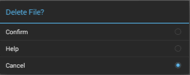
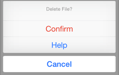
An option dialog is a modal view that includes a message and one or more option items positioned in the middle of the display on Android and at the bottom edge on iOS. On Android, buttons may be added below the options.
| Android | iPhone | iPad |
|---|---|---|
 |  |  |
An option dialog is created using Titanium.UI.createOptionDialog or Alloy <OptionDialog> element. See Examples below for usage.
This dialog is presented differently on each platform, as described below.
Android
On Android, the dialog is shown in the middle of the display (not touching the edges), with the option items represented in a picker. The previously-selected, or default, item can be set on creation.
You can assign a View to the Titanium.UI.OptionDialog.androidView property to define a custom dialog UI and layout, or you can assign a set of options to the Titanium.UI.OptionDialog.options property, but not both. If both of these properties are set, the custom view will appear but the options will be hidden.
Buttons below the picker may be optionally defined using the buttonNames property. The click event returns a Boolean value to indicate whether either an option item or a button was clicked.
iOS
The destructive property may be set for an item, to give a visual cue that selecting it results in an irreversible action. Option dialogs are automatically cancelled when the application is paused/suspended.
iPhone
On iPhone, this dialog is shown at the bottom edge of the display, with the option items represented as vertical buttons.
iPad
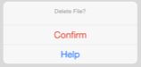
On iPad, this dialog is shown in the middle of the display, or as a popover-like dialog if another view or control is specified via an argument passed to the open() method.
Note that on iPad, the cancel button is not displayed -- users can cancel the dialog by clicking outside of the dialog.
Caveats
Care should be taken not to define any properties that are not documented, as this may produce unexpected results. For example, setting a message property will prevent the picker of option items from being displayed on Android.
Extends: Titanium.UI.View · Since: 0.8
Properties #
accessibilityDisableLongPress#
Type: Boolean
Boolean value to remove the long press notification for the device's accessibility service.
Will disable the "double tap and hold for long press" message when selecting an item.
androidView#
Type: Titanium.UI.View
View to load inside the message area, to create a custom layout.
On Android you can either define a custom view with this property, or you can assign a set of options to the
Titanium.UI.OptionDialog.options property, but not both. If you do, the custom view will appear
but not the options you defined.
In an Alloy application you can specify this property with either an <AndroidView/> or
<View/> element inside the <OptionDialog/> element, for example:
<Alloy>
    <OptionDialog id="dialog" title="Delete File?" onClick="clickCB">

        <!-- Add View or AndroidView for the androidView property -->
        <AndroidView platform="android" layout="vertical">
            <Label color="red" text="Warning!  This change is permanent and you cannot undo it!" />
        </AndroidView>

        <ButtonNames>
            <ButtonName>Confirm</ButtonName>
            <ButtonName>Cancel</ButtonName>
        </ButtonNames>
    </OptionDialog>
</Alloy>
apiName#
Type: String
The name of the API that this proxy corresponds to.
The value of this property is the fully qualified name of the API. For example, Button
returns Ti.UI.Button.
bubbleParent#
Type: Boolean
Indicates if the proxy will bubble an event to its parent.
Some proxies (most commonly views) have a relationship to other proxies, often
established by the add() method. For example, for a button added to a window, a
click event on the button would bubble up to the window. Other common parents are
table sections to their rows, table views to their sections, and scrollable views
to their views. Set this property to false to disable the bubbling to the proxy's parent.
buttonNames#
Type: Array<String>
List of button names.
This property creates buttons underneath the picker options.
The dialog only supports up to three buttons.
cancel#
Type: Number
Index to define the cancel option.
On iOS, set to -1 to disable the cancel option.
On iPad, the cancel option must be set to either -1 or the index of the last
option. For example, if there are 3 options and one of them is a cancel button,
the cancel button must be the last option (index 2). If cancel is set to a
different value, the last entry in the options
array is not displayed.
Note that the cancel button is never shown on iPad, since the user can cancel the
dialog by clicking outside of the dialog.
destructive#
Type: Number
Index to define the destructive option, indicated by a visual cue when rendered.
elevation#
Type: Number
Base elevation of the view relative to its parent in pixels.
The elevation of a view determines the appearance of its shadow.
Higher elevations produce larger and softer shadows.
Note: The elevation property only works on Titanium.UI.View objects.
Many Android components have a default elevation that cannot be modified.
For more information, see
Google design guidelines: Elevation and shadows.
filterTouchesWhenObscured#
Type: Boolean
Discards touch related events if another app's system overlay covers the view.
This is a security feature to protect an app from "tapjacking", where a malicious app can use a
system overlay to intercept touch events in your app or to trick the end-user to tap on UI
in your app intended for the overlay.
Setting this property to true causes touch related events (including "click") to not be fired
if a system overlay overlaps the view.
hiddenBehavior#
Type: Number
Sets the behavior when hiding an object to release or keep the free space
If setting hiddenBehavior to Titanium.UI.HIDDEN_BEHAVIOR_GONE it will automatically release the space the view occupied.
For example: in a vertical layout the views below the object will move up when you hide
an object with hiddenBehavior:Titanium.UI.HIDDEN_BEHAVIOR_GONE.
- Titanium.UI.HIDDEN_BEHAVIOR_INVISIBLE. Keeps the space and just hides the object (default).
- Titanium.UI.HIDDEN_BEHAVIOR_GONE. Releases the space and hides the object.
Defaults to Titanium.UI.HIDDEN_BEHAVIOR_INVISIBLE.
horizontalMotionEffect#
Type: MinMaxOptions
Adds a horizontal parallax effect to the view
Note that the parallax effect only happens by tilting the device so results can not be seen on Simulator.
To clear all motion effects, use the Titanium.UI.clearMotionEffects method.
id#
Type: String
View's identifier.
The id property of the Ti.UI.View represents the view's identifier. The identifier string does
not have to be unique. You can use this property with Titanium.UI.View.getViewById method.
keepHardwareMode#
Type: Boolean
A value indicating the render mode of the View
Set to true to keep hardware mode when using a border and transparent backgrounds.
lifecycleContainer#
Type: Titanium.UI.Window, Titanium.UI.TabGroup
The Window or TabGroup whose Activity lifecycle should be triggered on the proxy.
If this property is set to a Window or TabGroup, then the corresponding Activity lifecycle event callbacks
will also be called on the proxy. Proxies that require the activity lifecycle will need this property set
to the appropriate containing Window or TabGroup.
opaquebackground#
Type: Boolean
Boolean value indicating if the option dialog should have an opaque background.
This property is useful to ensure that the option dialog will display contents properly
on the iPad idiom without ghosting when scrolling. This property is only respected on the
iPad idiom on iOS 7 and above.
options#
Type: Array<String>
List of option names to display in the dialog.
On Android you can assign a set of options to the OptionDialog with this property, or
assign a custom view to the Titanium.UI.OptionDialog.androidView property, but not both.
If you do, the custom view will appear but not the options you defined.
persistent#
Type: Boolean
Boolean value indicating if the option dialog should only be cancelled by user gesture or by hide method.
This property is useful to ensure that the option dialog will not be ignored
by the user when the application is paused/suspended.
previewContext#
Type: Titanium.UI.iOS.PreviewContext
The preview context used in the 3D-Touch feature "Peek and Pop".
Preview context to present the "Peek and Pop" of a view. Use an configured instance
of Titanium.UI.iOS.PreviewContext here.
Note: This property can only be used on devices running iOS 9 or later and supporting 3D-Touch.
It is ignored on older devices and can manually be checked using Titanium.UI.iOS.forceTouchSupported.
rotation#
Type: Number
Clockwise 2D rotation of the view in degrees.
Translation values are applied to the static post layout value.
rotationX#
Type: Number
Clockwise rotation of the view in degrees (x-axis).
Translation values are applied to the static post layout value.
rotationY#
Type: Number
Clockwise rotation of the view in degrees (y-axis).
Translation values are applied to the static post layout value.
scaleX#
Type: Number
Scaling of the view in x-axis in pixels.
Translation values are applied to the static post layout value.
scaleY#
Type: Number
Scaling of the view in y-axis in pixels.
Translation values are applied to the static post layout value.
selectedIndex#
Type: Number
Defines the default selected option. Since 8.1.0, if not defined or -1 it will show a normal list instead of radio buttons.
tintColor#
Type: String, Titanium.UI.Color
The view's tintColor
This property is a direct correspondent of the tintColor property of UIView on iOS. If no value is specified,
the tintColor of the View is inherited from its superview.
tooltip#
Type: String
The default text to display in the control's tooltip.
Assigning a value to this property causes the tool tip to be displayed for the view.
Setting the property to null cancels the display of the tool tip for the view.
Note: This property is only used for apps targeting macOS Catalyst.
touchFeedback#
Type: Boolean
A material design visual construct that provides an instantaneous visual confirmation of touch point.
Touch feedback is only applied to a view's background. It is never applied to the view's foreground content
such as a Titanium.UI.ImageView's image.
For Titanium versions older than 9.1.0, touch feedback only works if you set the
Titanium.UI.View.backgroundColor property to a non-transparent color.
touchFeedbackColor#
Type: String
Optional touch feedback ripple color. This has no effect unless touchFeedback is true.
Defaults to provided theme color.
transitionName#
Type: String
A name to identify this view in activity transition.
Name should be unique in the View hierarchy.
translationX#
Type: Number
Horizontal location of the view relative to its left position in pixels.
Translation values are applied to the static post layout value.
translationY#
Type: Number
Vertical location of the view relative to its top position in pixels.
Translation values are applied to the static post layout value.
translationZ#
Type: Number
Depth of the view relative to its elevation in pixels.
Translation values are applied to the static post layout value.
verticalMotionEffect#
Type: MinMaxOptions
Adds a vertical parallax effect to the view
Note that the parallax effect only happens by tilting the device so results can not be seen on Simulator.
To clear all motion effects, use the Titanium.UI.clearMotionEffects method.
Methods #
addEventListener #
Adds the specified callback as an event listener for the named event.
| Name | Type | Summary | Optional |
|---|---|---|---|
name | String | Name of the event. | No |
callback | Callback<Titanium.Event> | Callback function to invoke when the event is fired. | No |
applyProperties #
Applies the properties to the proxy.
Properties are supplied as a dictionary. Each key-value pair in the object is applied to the proxy such that
myproxy[key] = value.
| Name | Type | Summary | Optional |
|---|---|---|---|
props | Dictionary | A dictionary of properties to apply. | No |
clearMotionEffects #
Removes all previously added motion effects.
Use this method together with Titanium.UI.horizontalMotionEffect and Titanium.UI.verticalMotionEffect.
fireEvent #
Fires a synthesized event to any registered listeners.
| Name | Type | Summary | Optional |
|---|---|---|---|
name | String | Name of the event. | No |
event | Dictionary | A dictionary of keys and values to add to the Titanium.Event object sent to the listeners. | Yes |
getViewById #
Returns the matching view of a given view ID.
| Name | Type | Summary | Optional |
|---|---|---|---|
id | String | The ID of the view that should be returned. Use the id property in your views toenable it for indexing in this method. | No |
Returns: Titanium.UI.View
hide #
Hides this dialog.
This triggers a click event as if cancel was invoked.
| Name | Type | Summary | Optional |
|---|---|---|---|
params | hideParams | Argument containing parameters for this method. Only used on iOS. | Yes |
insertAt #
Inserts a view at the specified position in the children array.
Useful if the layout property is set to horizontal or vertical.
| Name | Type | Summary | Optional |
|---|---|---|---|
params | ViewPositionOptions | Pass an object that specifies the view to insert and optionally at which position (defaults to end) | No |
removeEventListener #
Removes the specified callback as an event listener for the named event.
Multiple listeners can be registered for the same event, so the
callback parameter is used to determine which listener to remove.
When adding a listener, you must save a reference to the callback function
in order to remove the listener later:
var listener = function() { Ti.API.info("Event listener called."); }
window.addEventListener('click', listener);
To remove the listener, pass in a reference to the callback function:
window.removeEventListener('click', listener);
| Name | Type | Summary | Optional |
|---|---|---|---|
name | String | Name of the event. | No |
callback | Callback<Titanium.Event> | Callback function to remove. Must be the same function passed to addEventListener. | No |
show #
Shows this dialog.
On iPad, this dialog is shown in the middle of the display or, when specified via the
params argument, as a popover-like dialog attached to another view or control.
| Name | Type | Summary | Optional |
|---|---|---|---|
params | showParams | Argument containing parameters for this method. Only used on iPad. | Yes |
Events #
click #
Fired when an option of this dialog is clicked or, under certain circumstances, when this
dialog is dismissed.
On iOS as of Release 2.0, when the dialog is dismissed without using an option, for example, using
the hide method (iPhone, iPad) or a tap outside of the
dialog (iPad), this event is fired as though the cancel option was selected. In these
circumstances, the index property will be the cancel option index if defined or -1
otherwise.
| Name | Type | Summary |
|---|---|---|
index | Number | Index of the option that was pressed. See description for result of the dialog being dismissed in some other way. |
button | Boolean | Indicates whether the index returned by the index property relates to a button ratherthan an option item. |
cancel | Boolean, Number | Boolean type on Android; Number on iOS. On Android, indicates whether the cancel button was clicked, in which case returns true.On iOS, the value of the cancel property is returned, if defined, or -1 otherwise. |
destructive | Number | Index of the destructive option if defined or -1 otherwise. |
rotate #
Fired when the device detects a two finger rotation.
This event is fired when doing a two finger rotation and returning the angle.
The event occurs continuously until a finger is lifted again.
| Name | Type | Summary |
|---|---|---|
rotate | Number | Rotation in degrees. |
Examples #
Dialog with 3 Options
Ti.UI.backgroundColor = 'white';
var win = Ti.UI.createWindow({
  title: 'Click window to test',
  backgroundColor: 'white'
});

var opts = {
  cancel: 2,
  options: ['Confirm', 'Help', 'Cancel'],
  selectedIndex: 2,
  destructive: 0,
  title: 'Delete File?'
};

win.addEventListener('click', function(e){
  var dialog = Ti.UI.createOptionDialog(opts).show();
});
win.open();
Dialog with 2 Options and 1 Button on Android and 3 Options on iOS
var win = Ti.UI.createWindow({
  title: 'Click window to test OptionDialog',
  backgroundColor: 'white'
});

var opts = {
  title: 'Delete File?'
};

var isAndroid = Ti.Platform.osname === 'android';

if (isAndroid) {
  opts.options = ['Confirm', 'Cancel'];
  opts.buttonNames = ['Help'];
} else {
  opts.options = ['Confirm', 'Help', 'Cancel'];
}

var dialog;
win.addEventListener('click', function() {
  dialog = Ti.UI.createOptionDialog(opts);

  dialog.addEventListener('click', onSelectDialog);
  dialog.addEventListener('cancel', function(e) {
    alert('Dialog canceled! e.cancel = ' + e.cancel + ', e.index = ' + e.index);
  })

   dialog.show();
});

function onSelectDialog(e) {
  if (isAndroid) {
    if (e.button === false && e.index === 0) {
      alert('Confirm option selected! e.index = ' + e.index);
    }
    if (e.button === false && e.index === 1) {
      alert('Cancel option selected! e.index = ' + e.index);
    }
    if (e.button === true && e.index === 0) {
      alert('Help Button clicked! e.index = ' + e.index);
    }
  }
}

win.open();
Alloy XML Markup
Previous example as an Alloy view. You can set [cancel](Titanium.UI.OptionDialog.cancel) and [destructive](Titanium.UI.OptionDialog.destructive) on a `<Option/>` tag. optiondialog.xml:
<Alloy>
    <Window id="win" onClick="showOptions" title="Click window to test"
        fullscreen="false" onExit="true" backgroundColor="white">

        <!--
            The OptionDialog tag declares an option dialog,
            which will need to be opened by the controller.
        -->
        <OptionDialog id="dialog" title="Delete File?">

            <!-- The Options tag sets the options property. -->
            <Options>
                <Option destructive="true">Confirm</Option>
                <Option platform="ios">Help</Option>
                <Option cancel="true">Cancel</Option>
            </Options>

            <!-- The ButtonNames tag sets the Android-only buttonNames property. -->
            <ButtonNames>
                <ButtonName>Help</ButtonName>
            </ButtonNames>

            <!-- Add a View for the androidView property here. -->

        </OptionDialog>

        <!-- Add views here -->

    </Window>
</Alloy>
function showOptions(){
$.dialog.show();
}