Titanium.UI.Android.CollapseToolbar
A collapsing toolbar layout.
| Android |
|---|
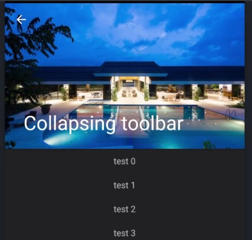 |
CollapseToolbar acts as a top-level container for window content that allows to set a parallax image and title in the toolbar. The main content goes into centerView and will automatically be scrollable.
Extends: Titanium.UI.View · Since: 12.1.0 · Platforms: android
Properties #
accessibilityDisableLongPress#
Type: Boolean
Boolean value to remove the long press notification for the device's accessibility service.
Will disable the "double tap and hold for long press" message when selecting an item.
apiName#
Type: String
The name of the API that this proxy corresponds to.
The value of this property is the fully qualified name of the API. For example, Button
returns Ti.UI.Button.
contentScrimColor#
Type: String
Background color of the small toolbar when the content is scrolled up.
displayHomeAsUp#
Type: Boolean
Displays an "up" affordance on the "home" area of the action bar.
See also: setDisplayHomeAsUpEnabled
in the Android Developer Reference.
height#
Type: Number, String
View height, in platform-specific units.
Defaults to: If undefined, defaults to either Titanium.UI.FILL or Titanium.UI.SIZE
depending on the view. See "View Types and Default Layout Behavior" in
Transitioning to the New UI Layout System.
Can be either a float value or a dimension string (for example, '50%' or '40dp').
Can also be one of the following special values:
- Titanium.UI.SIZE. The view should size itself to fit its contents.
- Titanium.UI.FILL. The view should size itself to fill its parent.
- 'auto'. Represents the default sizing behavior for a given type of
view. The use of 'auto' is deprecated, and should be replaced with theSIZEor
FILLconstants if it is necessary to set the view's behavior explicitly.
This is an input property for specifying the view's height dimension. To determine the
view's size once rendered, use the rect or
size properties.
horizontalMotionEffect#
Type: MinMaxOptions
Adds a horizontal parallax effect to the view
Note that the parallax effect only happens by tilting the device so results can not be seen on Simulator.
To clear all motion effects, use the Titanium.UI.clearMotionEffects method.
id#
Type: String
View's identifier.
The id property of the Ti.UI.View represents the view's identifier. The identifier string does
not have to be unique. You can use this property with Titanium.UI.View.getViewById method.
image#
Type: String
Background image for the full size toolbar. Has a parallax effect when scrolling upwards.
keepHardwareMode#
Type: Boolean
A value indicating the render mode of the View
Set to true to keep hardware mode when using a border and transparent backgrounds.
previewContext#
Type: Titanium.UI.iOS.PreviewContext
The preview context used in the 3D-Touch feature "Peek and Pop".
Preview context to present the "Peek and Pop" of a view. Use an configured instance
of Titanium.UI.iOS.PreviewContext here.
Note: This property can only be used on devices running iOS 9 or later and supporting 3D-Touch.
It is ignored on older devices and can manually be checked using Titanium.UI.iOS.forceTouchSupported.
tooltip#
Type: String
The default text to display in the control's tooltip.
Assigning a value to this property causes the tool tip to be displayed for the view.
Setting the property to null cancels the display of the tool tip for the view.
Note: This property is only used for apps targeting macOS Catalyst.
top#
Type: Number, String
The view's top position.
This position is relative to the view's parent. Exact interpretation depends on the
parent view's layout property. Can be either a float value or
a dimension string (for example, '50%' or '10px').
This is an input property for specifying where the view should be positioned, and does not
represent the view's calculated position.
verticalMotionEffect#
Type: MinMaxOptions
Adds a vertical parallax effect to the view
Note that the parallax effect only happens by tilting the device so results can not be seen on Simulator.
To clear all motion effects, use the Titanium.UI.clearMotionEffects method.
Methods #
clearMotionEffects #
Removes all previously added motion effects.
Use this method together with Titanium.UI.horizontalMotionEffect and Titanium.UI.verticalMotionEffect.
Events #
rotate #
Fired when the device detects a two finger rotation.
This event is fired when doing a two finger rotation and returning the angle.
The event occurs continuously until a finger is lifted again.
| Name | Type | Summary |
|---|---|---|
rotate | Number | Rotation in degrees. |
Examples #
Simple setup
The following code shows a simple drawer-layout usage.
const win = Ti.UI.createWindow({
	theme: "Theme.Titanium.DayNight.NoTitleBar"
});

const centerView = Ti.UI.createView({
	layout: "vertical",
	height: Ti.UI.SIZE
});

for (let i = 0; i < 40; ++i) {
	let lbl = Ti.UI.createLabel({
		text: "test " + i,
		height: 40
	});
	centerView.add(lbl);
}

const collapsingToolbar = Ti.UI.Android.createCollapseToolbar({
	contentScrimColor: "#333",
	top: 0,
	image: "default.png",
	title: "Collapsing toolbar"
});


win.addEventListener('open', function() {
	collapsingToolbar.contentView = centerView;
	collapsingToolbar.onHomeIconItemSelected = function() {
		alert("click click");
	};
	collapsingToolbar.displayHomeAsUp = true;
});

win.add(collapsingToolbar);
win.open();
Alloy example
<Alloy>
	<Window>

		<CollapseToolbar platform="android">

			<ContentView>
				<View backgroundColor="red" height="Ti.UI.SIZE">
					<Label>test</Label>
				</View>
			</ContentView>
		</CollapseToolbar>

	</Window>
</Alloy>