Titanium.UI.Picker
A control used to select one or more fixed values.
| Android | iOS |
|---|---|
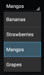 | 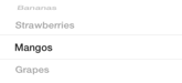 |
Use the Titanium.UI.createPicker method or Alloy <Picker> element to create a picker control.
On Android, the useSpinner property must be enabled to support multiple columns. By default, the spinner is automatically sized to fit its content and can overflow to additional spinner rows. The size of the picker can be adjusted with the width and height properties, but may omit picker columns or cut off picker rows if the size is set too small. This property is deprecated. Please use the default Android native "dropdown" style by not setting useSpinner to true.
On iOS, the height property is only available in iOS 9 and later. By default, the size of the picker, including its background, is fixed at the same height as the iPhone keyboard to respect the iOS Human Interface Guidelines. The default width on iOS is 320px and the height is 228px. The contents of the picker are sized to fit the picker, which may cut off text in the picker rows. Adding views to picker rows is also supported on iOS.
On iPad, Apple recommends using a picker only in a popover. Since the size of the picker cannot be adjusted, it is not suitable for the main screen.
Note: you can only set the columns property for the plain picker. If you set the type property to anything else except Titanium.UI.PICKER_TYPE_PLAIN, you cannot modify the picker's columns.
Extends: Titanium.UI.View · Since: 0.8 · Platforms: android, iphone, ipad, macos
Properties #
accessibilityDisableLongPress#
Type: Boolean
Boolean value to remove the long press notification for the device's accessibility service.
Will disable the "double tap and hold for long press" message when selecting an item.
accessibilityHidden#
Type: Boolean
Whether the view should be "hidden" from (i.e., ignored by) the accessibility service.
On iOS this is a direct analog of the accessibilityElementsHidden property defined in the
UIAccessibility Protocol.
On Android, setting accessibilityHidden calls the native
View.setImportantForAccessibility
method. The native method is only available in Android 4.1 (API level 16/Jelly Bean) and
later; if this property is specified on earlier versions of Android, it is ignored.
accessibilityHint#
Type: String
Briefly describes what performing an action (such as a click) on the view will do.
On iOS this is a direct analog of the accessibilityHint property defined in the
UIAccessibility Protocol.
On Android, it is concatenated together with
Titanium.UI.View.accessibilityLabel and Titanium.UI.View.accessibilityValue in the order: accessibilityLabel,
accessibilityValue, accessibilityHint. The concatenated value is then passed as the
argument to the native View.setContentDescription method.
accessibilityLabel#
Type: String
A succinct label identifying the view for the device's accessibility service.
On iOS this is a direct analog of the accessibilityLabel property defined in the
UIAccessibility Protocol.
On Android, it is concatenated together with
Titanium.UI.View.accessibilityValue and Titanium.UI.View.accessibilityHint in the order: accessibilityLabel,
accessibilityValue, accessibilityHint. The concatenated value is then passed as the
argument to the native View.setContentDescription method.
Defaults to Title or label of the control.
accessibilityValue#
Type: String
A string describing the value (if any) of the view for the device's accessibility service.
On iOS this is a direct analog of the accessibilityValue property defined in the
UIAccessibility Protocol.
On Android, it is concatenated together with
Titanium.UI.View.accessibilityLabel and Titanium.UI.View.accessibilityHint in the order: accessibilityLabel,
accessibilityValue, accessibilityHint. The concatenated value is then passed as the
argument to the native View.setContentDescription method.
Defaults to State or value of the control.
apiName#
Type: String
The name of the API that this proxy corresponds to.
The value of this property is the fully qualified name of the API. For example, Button
returns Ti.UI.Button.
backgroundColor#
Type: String, Titanium.UI.Color
Background color of the picker, as a color name or hex triplet.
For information about color values, see the "Colors" section of Titanium.UI.
Android: If you want to change the backgroundColor you have to set the borderStyle to
Ti.UI.INPUT_BORDERSTYLE_ROUNDED or Ti.UI.INPUT_BORDERSTYLE_NONE
borderColor#
Type: String, Titanium.UI.Color
Border color of the view, as a color name or hex triplet.
For information about color values, see the "Colors" section of Titanium.UI.
Defaults to the normal background color of this view (Android), black (iOS).
borderRadius#
Type: Number, String, Array<Number>, Array<String>
Radius for the rounded corners of the view's border.
Each corner is rounded using an arc of a circle.
Values for each corner can be specified. For example, '20px 20px' will set both left and right corners to 20px.
Specifying '20px 20px 20px 20px' will set top-left, top-right, bottom-right and bottom-left corners in that order.
If you have issues with dark artifacts on Android you can try to disable Hardware acceleration by setting a
backgroundColor with a small amount of transparency: backgroundColor:"rgba(255,255,255,254)".
borderStyle#
Type: Number
Border style to use when picker is shown as a text field or drop-down field.
This is an Android only property which only applies to pickers of type:
-
PICKER_TYPE_DATE or PICKER_TYPE_TIME
that also have datePickerStyle set to
DATE_PICKER_STYLE_COMPACT. -
PICKER_TYPE_PLAIN that also have property
useSpinner setfalseto show a drop-down picker.
borderWidth#
Type: Number
Border width of the view.
If borderColor is set without borderWidth, this value
will be changed to 1 of the unit declared as 'ti.ui.defaultunit' in tiapp.xml descriptor.
bottom#
Type: Number, String
View's bottom position, in platform-specific units.
This position is relative to the view's parent. Exact interpretation depends on the parent
view's layout property. Can be either a float value or a
dimension string (for example, '50%' or '10px').
This is an input property for specifying where the view should be positioned, and does not
represent the view's calculated position.
Defaults to undefined.
bubbleParent#
Type: Boolean
Indicates if the proxy will bubble an event to its parent.
Some proxies (most commonly views) have a relationship to other proxies, often
established by the add() method. For example, for a button added to a window, a
click event on the button would bubble up to the window. Other common parents are
table sections to their rows, table views to their sections, and scrollable views
to their views. Set this property to false to disable the bubbling to the proxy's parent.
calendarViewShown#
Type: Boolean
Determines whether the calenderView is visible.
If 'calendarViewShown' is 'true', the calenderView is visible
clipMode#
Type: Number
View's clipping behavior.
Setting this to Titanium.UI.iOS.CLIP_MODE_ENABLED enforces all child views to be clipped to this views bounds.
Setting this to Titanium.UI.iOS.CLIP_MODE_DISABLED allows child views to be drawn outside the bounds of this view.
When set to Titanium.UI.iOS.CLIP_MODE_DEFAULT or when this property is not set, clipping behavior is inferred.
See section on iOS Clipping Behavior in Titanium.UI.View.
Defaults to undefined. Behaves as if set to Titanium.UI.iOS.CLIP_MODE_DEFAULT.
columns#
Type: Array<Titanium.UI.PickerColumn>
Columns used for this picker, as an array of Titanium.UI.PickerColumn objects.
You can only set columns for the plain picker. If you set the type to anything
else except Titanium.UI.PICKER_TYPE_PLAIN, you cannot modify the columns.
In an Alloy application you can specify this property with a <PickerColumn> (or <Column>)
element that contains one or more <PickerRow> (or <Row>) elements, as shown below:
<Alloy>
    <Window>
        <Picker useSpinner="true">
            <PickerColumn id="column1">
                <PickerRow title="Bananas"/>
                <PickerRow title="Strawberries"/>
                <PickerRow title="Mangos"/>
            </PickerColumn>
            <!-- Picker shorthand notation -->
            <Column id="column2">
                <Row title="red"/>
                <Row title="green"/>
                <Row title="blue"/>
            </Column>
        </Picker>
    </Window>
</Alloy>
countDownDuration#
Type: Number
Duration in milliseconds used for a Countdown Timer picker.
Applicable to Titanium.UI.PICKER_TYPE_COUNT_DOWN_TIMER picker types.
datePickerStyle#
Type: Number
Determines how a date or time picker should appear.
Used to display the picker has calendar/clock view, as wheel spinners, or
as a field which displays selection dialog when tapped on.
This property is ignored if the type property is set to
Titanium.UI.PICKER_TYPE_PLAIN.
dateTimeColor#
Type: String, Titanium.UI.Color
Sets the text color of date- and time-pickers.
Applicable to Titanium.UI.PICKER_TYPE_TIME and Titanium.UI.PICKER_TYPE_DATE_AND_TIME picker types.
The picker type Titanium.UI.PICKER_TYPE_DATE does not support text customizing as stated in the
UIKit User Interface Catalog.
Important: On iOS 14+, you also have to set the Titanium.UI.Picker.datePickerStyle to
Titanium.UI.DATE_PICKER_STYLE_WHEELS in order to use this property.
elevation#
Type: Number
Base elevation of the view relative to its parent in pixels.
The elevation of a view determines the appearance of its shadow.
Higher elevations produce larger and softer shadows.
Note: The elevation property only works on Titanium.UI.View objects.
Many Android components have a default elevation that cannot be modified.
For more information, see
Google design guidelines: Elevation and shadows.
filterTouchesWhenObscured#
Type: Boolean
Discards touch related events if another app's system overlay covers the view.
This is a security feature to protect an app from "tapjacking", where a malicious app can use a
system overlay to intercept touch events in your app or to trick the end-user to tap on UI
in your app intended for the overlay.
Setting this property to true causes touch related events (including "click") to not be fired
if a system overlay overlaps the view.
focusable#
Type: Boolean
Whether view should be focusable while navigating with the trackball.
font#
Type: Font
Font to use for text.
Only applicable to Titanium.UI.PICKER_TYPE_DATE and Titanium.UI.PICKER_TYPE_TIME
picker types for android. For Titanium.UI.PICKER_TYPE_PLAIN, refer to Titanium.UI.PickerColumn
for android, and Titanium.UI.PickerRow for iphone / ipad.
format24#
Type: Boolean
Determines whether the Time pickers display in 24-hour or 12-hour clock format.
Only applicable to pickers of type Titanium.UI.PICKER_TYPE_TIME.
When this property is set true, a time picker is displayed with hours 0 through 23.
When set false, hours will be 1 through 12 with am/pm controls.
height#
Type: Number, String
View height, in platform-specific units.
Defaults to: If undefined, defaults to either Titanium.UI.FILL or Titanium.UI.SIZE
depending on the view. See "View Types and Default Layout Behavior" in
Transitioning to the New UI Layout System.
Can be either a float value or a dimension string (for example, '50%' or '40dp').
Can also be one of the following special values:
- Titanium.UI.SIZE. The view should size itself to fit its contents.
- Titanium.UI.FILL. The view should size itself to fill its parent.
- 'auto'. Represents the default sizing behavior for a given type of
view. The use of 'auto' is deprecated, and should be replaced with theSIZEor
FILLconstants if it is necessary to set the view's behavior explicitly.
This is an input property for specifying the view's height dimension. To determine the
view's size once rendered, use the rect or
size properties.
hiddenBehavior#
Type: Number
Sets the behavior when hiding an object to release or keep the free space
If setting hiddenBehavior to Titanium.UI.HIDDEN_BEHAVIOR_GONE it will automatically release the space the view occupied.
For example: in a vertical layout the views below the object will move up when you hide
an object with hiddenBehavior:Titanium.UI.HIDDEN_BEHAVIOR_GONE.
- Titanium.UI.HIDDEN_BEHAVIOR_INVISIBLE. Keeps the space and just hides the object (default).
- Titanium.UI.HIDDEN_BEHAVIOR_GONE. Releases the space and hides the object.
Defaults to Titanium.UI.HIDDEN_BEHAVIOR_INVISIBLE.
hintText#
Type: String
Text to be shown above date/time when picker is shown as a text field or drop-down field.
This is an Android only property which only applies to pickers of type:
-
PICKER_TYPE_DATE or PICKER_TYPE_TIME
that also have datePickerStyle set to
DATE_PICKER_STYLE_COMPACT. -
PICKER_TYPE_PLAIN that also have property
useSpinner setfalseto show a drop-down picker.
horizontalMotionEffect#
Type: MinMaxOptions
Adds a horizontal parallax effect to the view
Note that the parallax effect only happens by tilting the device so results can not be seen on Simulator.
To clear all motion effects, use the Titanium.UI.clearMotionEffects method.
horizontalWrap#
Type: Boolean
Determines whether the layout has wrapping behavior.
For more information, see the discussion of horizontal layout mode in the description of
the layout property.
id#
Type: String
View's identifier.
The id property of the Ti.UI.View represents the view's identifier. The identifier string does
not have to be unique. You can use this property with Titanium.UI.View.getViewById method.
keepHardwareMode#
Type: Boolean
A value indicating the render mode of the View
Set to true to keep hardware mode when using a border and transparent backgrounds.
keepScreenOn#
Type: Boolean
Determines whether to keep the device screen on.
When true the screen will not power down. Note: enabling this feature will use more
power, thereby adversely affecting run time when on battery.
For iOS look at Titanium.App.idleTimerDisabled.
left#
Type: Number, String
View's left position, in platform-specific units.
This position is relative to the view's parent. Exact interpretation depends on the
parent view's layout property. Can be either a float value or
a dimension string (for example, '50%' or '10px').
This is an input property for specifying where the view should be positioned, and does not
represent the view's calculated position.
Defaults to undefined.
lifecycleContainer#
Type: Titanium.UI.Window, Titanium.UI.TabGroup
The Window or TabGroup whose Activity lifecycle should be triggered on the proxy.
If this property is set to a Window or TabGroup, then the corresponding Activity lifecycle event callbacks
will also be called on the proxy. Proxies that require the activity lifecycle will need this property set
to the appropriate containing Window or TabGroup.
locale#
Type: String
Locale used when displaying Date and Time picker values.
Applicable to Titanium.UI.PICKER_TYPE_DATE, Titanium.UI.PICKER_TYPE_TIME and
Titanium.UI.PICKER_TYPE_DATE_AND_TIME picker types.
Locale must be represented as a combination of ISO 2-letter language and country codes.
For example, en-US or en-GB. See the
ISO 639-1 and
ISO 3166-1 alpha-2
sections of wikipedia for reference.
On iOS, the system locale is always used.
maxDate#
Type: Date
Maximum date displayed when a Date picker is in use.
Applicable to Titanium.UI.PICKER_TYPE_DATE and Titanium.UI.PICKER_TYPE_DATE_AND_TIME
picker types.
For JavaScript files, use a JavaScript Date object.
For Alloy XML and TSS files, use a date string that can be parsed by the
moment.js constructor,
which includes ISO-8601 and RFC2822 dates.
This property is ignored when maxDate is less than minDate.
minDate#
Type: Date
Minimum date displayed when a Date picker is in use.
Applicable to Titanium.UI.PICKER_TYPE_DATE and Titanium.UI.PICKER_TYPE_DATE_AND_TIME
picker types.
For JavaScript files, use a JavaScript Date object.
For Alloy XML and TSS files, use a date string that can be parsed by the
moment.js constructor,
which includes ISO-8601 and RFC2822 dates.
This property is ignored when maxDate is less than minDate.
minuteInterval#
Type: Number
Interval in minutes displayed when one of the Time types of pickers is in use.
Applicable to Titanium.UI.PICKER_TYPE_TIME and Titanium.UI.PICKER_TYPE_DATE_AND_TIME
picker types.
The minimum permitted value is 1 and maximum is 30. If the value cannot be evenly divided
into 60, the default value is used.
nativeSpinner#
Type: Boolean
Determines if a multi-column spinner or single column drop-down picker should be used.
This property is intended to be used by time picker types.
If true, Android will show hour, minute, and am/pm spinners like iOS.
If false, Android will display a clock view.
If undefined with Titanium 10.0.1 or higher, the
datePickerStyle property is used.
As of Titanium 10.0.1, this property has the same effect as the
useSpinner property which also shows a native spinner.
const picker = Ti.UI.createPicker({
    type: Ti.UI.PICKER_TYPE_TIME,
    nativeSpinner: true,
    format24: false,
    minuteInterval: 4,
    minDate: new Date(2018, 5, 24),
    maxDate: new Date(2020, 5, 24),
    value: new Date(2019, 5, 24)
});
opacity#
Type: Number
Opacity of this view, from 0.0 (transparent) to 1.0 (opaque). Defaults to 1.0 (opaque).
overrideCurrentAnimation#
Type: Boolean
When on, animate call overrides current animation if applicable.
If this property is set to false, the animate call is ignored if the view is currently being animated.
Defaults to undefined but behaves as false
overrideUserInterfaceStyle#
Type: Number
Forces the picker to used assigned theme instead of the system theme.
When set to USER_INTERFACE_STYLE_DARK or
USER_INTERFACE_STYLE_LIGHT, the picker will ignore
the system's current theme and use the theme assigned to this property instead.
When set to USER_INTERFACE_STYLE_UNSPECIFIED,
the picker will use the system's current theme.
previewContext#
Type: Titanium.UI.iOS.PreviewContext
The preview context used in the 3D-Touch feature "Peek and Pop".
Preview context to present the "Peek and Pop" of a view. Use an configured instance
of Titanium.UI.iOS.PreviewContext here.
Note: This property can only be used on devices running iOS 9 or later and supporting 3D-Touch.
It is ignored on older devices and can manually be checked using Titanium.UI.iOS.forceTouchSupported.
pullBackgroundColor#
Type: String, Titanium.UI.Color
Background color of the wrapper view when this view is used as either Titanium.UI.ListView.pullView or Titanium.UI.TableView.headerPullView.
Defaults to undefined. Results in a light grey background color on the wrapper view.
rect#
Type: DimensionWithAbsolutes
The bounding box of the view relative to its parent, in system units.
The view's bounding box is defined by its size and position.
The view's size is rect.width x rect.height. The view's top-left position relative to
its parent is (rect.x , rect.y).
On Android it will also return rect.absoluteX and 'rect.absoluteY' which are relative to
the main window.
The correct values will only be available when layout is complete.
To determine when layout is complete, add a listener for the
postlayout event.
right#
Type: Number, String
View's right position, in platform-specific units.
This position is relative to the view's parent. Exact interpretation depends on the
parent view's layout property. Can be either a float value or
a dimension string (for example, '50%' or '10px').
This is an input property for specifying where the view should be positioned, and does not
represent the view's calculated position.
Defaults to undefined.
rotation#
Type: Number
Clockwise 2D rotation of the view in degrees.
Translation values are applied to the static post layout value.
rotationX#
Type: Number
Clockwise rotation of the view in degrees (x-axis).
Translation values are applied to the static post layout value.
rotationY#
Type: Number
Clockwise rotation of the view in degrees (y-axis).
Translation values are applied to the static post layout value.
scaleX#
Type: Number
Scaling of the view in x-axis in pixels.
Translation values are applied to the static post layout value.
scaleY#
Type: Number
Scaling of the view in y-axis in pixels.
Translation values are applied to the static post layout value.
selectionIndicator (deprecated)#
Type: Boolean
Determines whether the visual selection indicator is shown.
As of Titanium 10.0.1, this property will be ignored and Android will always show an indicator.
selectionOpens#
Type: Boolean
Determines whether calling the method setSelectedRow opens when called
If true, selection will open when setSelectedRow is called.
If false, selection will not open when setSelectedRow is called.
size#
Type: Dimension
The size of the view in system units.
Although property returns a <Dimension> dictionary, only the width and height
properties are valid. The position properties--x and y--are always 0.
To find the position and size of the view, use the rect
property instead.
The correct values will only be available when layout is complete.
To determine when layout is complete, add a listener for the
postlayout event.
softKeyboardOnFocus#
Type: Number
Determines keyboard behavior when this view is focused. Defaults to Titanium.UI.Android.SOFT_KEYBOARD_DEFAULT_ON_FOCUS.
textAlign#
Type: String, Number
Horizontal text alignment of the date picker when using Titanium.UI.PICKER_TYPE_DATE.
tooltip#
Type: String
The default text to display in the control's tooltip.
Assigning a value to this property causes the tool tip to be displayed for the view.
Setting the property to null cancels the display of the tool tip for the view.
Note: This property is only used for apps targeting macOS Catalyst.
top#
Type: Number, String
The view's top position.
This position is relative to the view's parent. Exact interpretation depends on the
parent view's layout property. Can be either a float value or
a dimension string (for example, '50%' or '10px').
This is an input property for specifying where the view should be positioned, and does not
represent the view's calculated position.
touchEnabled#
Type: Boolean
Determines whether view should receive touch events.
If false, will forward the events to peers.
touchFeedback#
Type: Boolean
A material design visual construct that provides an instantaneous visual confirmation of touch point.
Touch feedback is only applied to a view's background. It is never applied to the view's foreground content
such as a Titanium.UI.ImageView's image.
For Titanium versions older than 9.1.0, touch feedback only works if you set the
Titanium.UI.View.backgroundColor property to a non-transparent color.
touchFeedbackColor#
Type: String
Optional touch feedback ripple color. This has no effect unless touchFeedback is true.
Defaults to provided theme color.
transform#
Type: Titanium.UI.Matrix2D, Titanium.UI.Matrix3D
Transformation matrix to apply to the view.
Android only supports Matrix2D transforms.
transitionName#
Type: String
A name to identify this view in activity transition.
Name should be unique in the View hierarchy.
translationX#
Type: Number
Horizontal location of the view relative to its left position in pixels.
Translation values are applied to the static post layout value.
translationY#
Type: Number
Vertical location of the view relative to its top position in pixels.
Translation values are applied to the static post layout value.
translationZ#
Type: Number
Depth of the view relative to its elevation in pixels.
Translation values are applied to the static post layout value.
type#
Type: Number
Determines the type of picker displayed
You can only set columns for the plain picker. If you set the type to anything
else except Titanium.UI.PICKER_TYPE_PLAIN, you cannot modify the columns.
PICKER_TYPE_DATE_AND_TIME is only available for iOS.
PICKER_TYPE_COUNT_DOWN_TIMER is only available for iOS.
useSpinner#
Type: Boolean
Determines if a multi-column spinner or single column drop-down picker should be used.
This property is intended to be used by plain picker types. When set on date/time pickers,
this property will override the datePickerStyle property.
If true, Android will show spinners for each column like iOS.
If false, Android will display the 1st column as a drop-down list picker and all other
columns will be ignored.
As of Titanium 10.0.1, this property shows a native Android spinner widget like how the
nativeSpinner property worked in older versions.
On older Titanium versions, this property shows a non-native custom spinner view.
value#
Type: Date
Date and time value for Date and Time pickers.
Applicable to Titanium.UI.PICKER_TYPE_DATE, Titanium.UI.PICKER_TYPE_TIME and Titanium.UI.PICKER_TYPE_DATE_AND_TIME
picker types.
For JavaScript files, use a JavaScript Date object.
For Alloy XML and TSS files, use a date string that can be parsed by the
moment.js constructor,
which includes ISO-8601 and RFC2822 dates.
verticalMotionEffect#
Type: MinMaxOptions
Adds a vertical parallax effect to the view
Note that the parallax effect only happens by tilting the device so results can not be seen on Simulator.
To clear all motion effects, use the Titanium.UI.clearMotionEffects method.
viewShadowColor#
Type: String, Titanium.UI.Color
Determines the color of the shadow.
iOS Defaults to undefined. Behaves as if transparent. Android default is black.
On Android you can set <item name="android:ambientShadowAlpha">0.5</item> and
<item name="android:spotShadowAlpha">0.5</item> in your theme to change the
opacity.
viewShadowOffset#
Type: Point
Determines the offset for the shadow of the view.
Defaults to undefined. Behaves as if set to (0,-3)
viewShadowRadius#
Type: Number, String
Determines the blur radius used to create the shadow.
Defaults to undefined. Behaves as if set to 3. Accepts density units as of 10.0.1.
visibleItems (deprecated)#
Type: Number
Number of visible rows to display. This is only applicable to a plain picker and when the
useSpinner is true.
The spinner-style Android picker shows 5 rows by default; one selected in the middle and 2
above and below. Set to an odd number to ensure the selected row is in the middle.
width#
Type: Number, String
View's width, in platform-specific units.
Defaults to: If undefined, defaults to either Titanium.UI.FILL or Titanium.UI.SIZE
depending on the view. See "View Types and Default Layout Behavior" in
Transitioning to the New UI Layout System.
Can be either a float value or a dimension string (for example, '50%' or '40dp').
Can also be one of the following special values:
- Titanium.UI.SIZE. The view should size itself to fit its contents.
- Titanium.UI.FILL. The view should size itself to fill its parent.
- 'auto'. Represents the default sizing behavior for a given type of
view. The use of 'auto' is deprecated, and should be replaced with theSIZEor
FILLconstants if it is necessary to set the view's behavior explicitly.
This is an input property for specifying the view's width dimension. To determine
the view's size once rendered, use the rect or
size properties.
Methods #
add #
Adds rows or columns to the picker.
Once you use this method to add rows and columns to a picker, you cannot remove or
manipulate them.
| Name | Type | Summary | Optional |
|---|---|---|---|
data | Array<Titanium.UI.PickerRow>, Titanium.UI.PickerRow, Array<Titanium.UI.PickerColumn>, Titanium.UI.PickerColumn | A row, set of rows, a column of rows or a set of columns of rows. When this method is used to add a row or set of rows, a single-column picker is created. | No |
addEventListener #
Adds the specified callback as an event listener for the named event.
| Name | Type | Summary | Optional |
|---|---|---|---|
name | String | Name of the event. | No |
callback | Callback<Titanium.Event> | Callback function to invoke when the event is fired. | No |
animate #
Animates this view.
The Animation object or dictionary passed to this method defines
the end state for the animation, the duration of the animation, and other properties.
Note that on SDKs older than 9.1.0 - if you use animate to move a view, the view's actual position is changed, but
its layout properties, such as top, left, center and so on are not changed--these
reflect the original values set by the user, not the actual position of the view.
As of SDK 9.1.0, the final values of the animation will be set on the view just before the complete event and/or the callback is fired.
The rect property can be used to determine the actual size and
position of the view.
| Name | Type | Summary | Optional |
|---|---|---|---|
animation | Titanium.UI.Animation, Dictionary<Titanium.UI.Animation> | Either a dictionary of animation properties or an Animation object. | No |
callback | Callback<Object> | Function to be invoked upon completion of the animation. | Yes |
applyProperties #
Applies the properties to the proxy.
Properties are supplied as a dictionary. Each key-value pair in the object is applied to the proxy such that
myproxy[key] = value.
| Name | Type | Summary | Optional |
|---|---|---|---|
props | Dictionary | A dictionary of properties to apply. | No |
clearMotionEffects #
Removes all previously added motion effects.
Use this method together with Titanium.UI.horizontalMotionEffect and Titanium.UI.verticalMotionEffect.
convertPointToView #
Translates a point from this view's coordinate system to another view's coordinate system.
Returns null if either view is not in the view hierarchy.
Keep in mind that views may be removed from the view hierarchy if their window is blurred
or if the view is offscreen (such as in some situations with Titanium.UI.ScrollableView).
If this view is a Titanium.UI.ScrollView, the view's x and y offsets are subtracted from
the return value.
| Name | Type | Summary | Optional |
|---|---|---|---|
point | Point | A point in this view's coordinate system. If this argument is missing an x or y property, or the properties can not beconverted into numbers, an exception will be raised. | No |
destinationView | Titanium.UI.View | View that specifies the destination coordinate system to convert to. If this argument is not a view, an exception will be raised. | No |
Returns: Point
fireEvent #
Fires a synthesized event to any registered listeners.
| Name | Type | Summary | Optional |
|---|---|---|---|
name | String | Name of the event. | No |
event | Dictionary | A dictionary of keys and values to add to the Titanium.Event object sent to the listeners. | Yes |
getSelectedRow #
Gets the selected row for a column, or null if none exists.
| Name | Type | Summary | Optional |
|---|---|---|---|
index | Number | A column index. | No |
Returns: Titanium.UI.PickerRow
getViewById #
Returns the matching view of a given view ID.
| Name | Type | Summary | Optional |
|---|---|---|---|
id | String | The ID of the view that should be returned. Use the id property in your views toenable it for indexing in this method. | No |
Returns: Titanium.UI.View
hide #
Hides this view.
| Name | Type | Summary | Optional |
|---|---|---|---|
options | AnimatedOptions | Animation options for Android only. Since SDK 5.1.0 and used only on Android 5.0+ Determines whether to enable a circular reveal animation. Note that the default here is equivalent to passing in { animated: false } | Yes |
insertAt #
Inserts a view at the specified position in the children array.
Useful if the layout property is set to horizontal or vertical.
| Name | Type | Summary | Optional |
|---|---|---|---|
params | ViewPositionOptions | Pass an object that specifies the view to insert and optionally at which position (defaults to end) | No |
reloadColumn #
Repopulates values for a column.
| Name | Type | Summary | Optional |
|---|---|---|---|
column | Titanium.UI.PickerColumn | Column to repopulate. | No |
removeEventListener #
Removes the specified callback as an event listener for the named event.
Multiple listeners can be registered for the same event, so the
callback parameter is used to determine which listener to remove.
When adding a listener, you must save a reference to the callback function
in order to remove the listener later:
var listener = function() { Ti.API.info("Event listener called."); }
window.addEventListener('click', listener);
To remove the listener, pass in a reference to the callback function:
window.removeEventListener('click', listener);
| Name | Type | Summary | Optional |
|---|---|---|---|
name | String | Name of the event. | No |
callback | Callback<Titanium.Event> | Callback function to remove. Must be the same function passed to addEventListener. | No |
setSelectedRow #
Selects a column's row.
On iOS, this method must be called after the picker is rendered.
On Android, the picker has a default value of 0 for both column and row index.
| Name | Type | Summary | Optional |
|---|---|---|---|
column | Number | A column index. | No |
row | Number | A row index. | No |
animated | Boolean | Determines whether the selection should be animated. (iPhone, iPad-only) | Yes |
setValue #
Sets the date and time value property for Date pickers.
Applicable to the Titanium.UI.PICKER_TYPE_DATE and Titanium.UI.PICKER_TYPE_DATE_AND_TIME
picker types.
| Name | Type | Summary | Optional |
|---|---|---|---|
date | Date | A Javascript Date object. | No |
Returns: Titanium.UI.PickerRow
show #
Makes this view visible.
| Name | Type | Summary | Optional |
|---|---|---|---|
options | AnimatedOptions | Animation options for Android only. Since SDK 5.1.0 and only used on Android 5.0+ Determines whether to enable a circular reveal animation. Note that the default here is equivalent to passing in { animated: false } | Yes |
showDatePickerDialog #
Shows Date picker as a modal dialog.
Applicable to the Titanium.UI.PICKER_TYPE_DATE picker type.
See "Date Picker using showDatePickerDialog()" for an example.
| Name | Type | Summary | Optional |
|---|---|---|---|
dictObj | Object | Dictionary object with a subset of Titanium.UI.Picker propertiesand a callback defined. Acceptable object properties are callback, title and value. Property okButtonTitle is onlysupported on Titanium versions older than 10.0.0. | No |
showTimePickerDialog #
Shows Time picker as a modal dialog.
Applicable to the Titanium.UI.PICKER_TYPE_TIME picker type.
See "Date Picker using showDatePickerDialog()" for a similar example.
| Name | Type | Summary | Optional |
|---|---|---|---|
dictObj | Object | Dictionary object with a subset of Titanium.UI.Picker propertiesand a callback defined. Acceptable object properties are callback, format24, title and value.Property okButtonTitle is only supported on Titanium versions older than 10.0.0. | No |
toImage #
Returns an image of the rendered view, as a Blob.
The honorScaleFactor argument is only supported on iOS.
| Name | Type | Summary | Optional |
|---|---|---|---|
callback | Callback<Titanium.Blob> | Function to be invoked upon completion. If non-null, this method will be performed asynchronously. If null, it will be performed immediately. | Yes |
honorScaleFactor | Boolean | Determines whether the image is scaled based on scale factor of main screen. (iOS only) When set to true, image is scale factor is honored. When set to false, the image in the blob has the same dimensions for retina and non-retina devices. | Yes |
Returns: Titanium.Blob
Events #
change #
Fired when the value of any column's row is changed.
| Name | Type | Summary |
|---|---|---|
columnIndex | Number | Selected column index. On iOS, only applicable to Titanium.UI.PICKER_TYPE_PLAIN picker types. |
rowIndex | Number | Selected row index. On iOS, only applicable to Titanium.UI.PICKER_TYPE_PLAIN picker types. |
column | Titanium.UI.PickerColumn | The column object. On iOS, only applicable to Titanium.UI.PICKER_TYPE_PLAIN picker types. |
countDownDuration | Number | The selected duration in milliseconds. Applicable to Titanium.UI.PICKER_TYPE_COUNT_DOWN_TIMER picker types. |
value | String | The selected value. Applicable to date/time pickers only. This property is read-only on Android. |
row | Titanium.UI.PickerRow | The row object. On iOS, only applicable to Titanium.UI.PICKER_TYPE_PLAIN picker types. |
selectedValue | Array<String> | Array of selected values, one element per column in the picker. Applicable to Titanium.UI.PICKER_TYPE_PLAIN picker types. |
click #
Fired when the device detects a click against the view.
This event is only available for non-spinner plain pickers.
| Name | Type | Summary |
|---|---|---|
x | Number | X coordinate of the event from the source view's coordinate system. |
y | Number | Y coordinate of the event from the source view's coordinate system. |
dblclick #
Fired when the device detects a double click against the view.
| Name | Type | Summary |
|---|---|---|
x | Number | X coordinate of the event from the source view's coordinate system. |
y | Number | Y coordinate of the event from the source view's coordinate system. |
obscured | Boolean | Returns true if the double click passed through an overlapping window belonging to another app.This is a security feature to protect an app from "tapjacking", where a malicious app can use a system overlay to intercept touch events in your app or to trick the end-user to tap on UI in your app intended for the overlay. |
doubletap #
Fired when the device detects a double tap against the view.
| Name | Type | Summary |
|---|---|---|
x | Number | X coordinate of the event from the source view's coordinate system. |
y | Number | Y coordinate of the event from the source view's coordinate system. |
obscured | Boolean | Returns true if the double tap passed through an overlapping window belonging to another app.This is a security feature to protect an app from "tapjacking", where a malicious app can use a system overlay to intercept touch events in your app or to trick the end-user to tap on UI in your app intended for the overlay. |
focus #
Fired when the view element gains focus.
This event only fires when using the trackball to navigate.
keypressed #
Fired when a hardware key is pressed in the view.
A keypressed event is generated by pressing a hardware key. On Android, this event can only be
fired when the property focusable is set to true. On iOS the
event is generated only when using Ti.UI.TextArea, Ti.UI.TextField
and Ti.UI.SearchBar.
| Name | Type | Summary |
|---|---|---|
keyCode | Number | The code for the physical key that was pressed. For more details, see KeyEvent. This API is experimental and subject to change. |
longclick #
Fired when the device detects a long click.
A long click is generated by touching and holding on the touchscreen or holding down the
trackball button.
The event occurs before the finger/button is lifted.
A longpress and a longclick can occur together.
As the trackball can fire this event, it is not intended to return the x and y
coordinates of the touch, even when it is generated by the touchscreen.
A longclick blocks a click, meaning that a click event will not fire when a
longclick listener exists.
longpress #
Fired when the device detects a long press.
A long press is generated by touching and holding on the touchscreen. Unlike a longclick,
it does not respond to the trackball button.
The event occurs before the finger is lifted.
A longpress and a longclick can occur together.
In contrast to a longclick, this event returns the x and y coordinates of the touch.
| Name | Type | Summary |
|---|---|---|
x | Number | X coordinate of the event from the source view's coordinate system. |
y | Number | Y coordinate of the event from the source view's coordinate system. |
obscured | Boolean | Returns true if the long press passed through an overlapping window belonging to another app.This is a security feature to protect an app from "tapjacking", where a malicious app can use a system overlay to intercept touch events in your app or to trick the end-user to tap on UI in your app intended for the overlay. |
pinch #
Fired when the device detects a pinch gesture.
A pinch is a touch and expand or contract
with two fingers. The event occurs continuously until a finger is lifted again.
| Name | Type | Summary |
|---|---|---|
scale | Number | The scale factor relative to the points of the two touches in screen coordinates. |
velocity | Number | The velocity of the pinch in scale factor per second. |
time | Number | The event time of the current event being processed. |
timeDelta | Number | The time difference in milliseconds between the previous accepted scaling event and the current scaling event. |
currentSpan | Number | The average distance between each of the pointers forming the gesture in progress through the focal point. |
currentSpanX | Number | The average X distance between each of the pointers forming the gesture in progress through the focal point. |
currentSpanY | Number | The average Y distance between each of the pointers forming the gesture in progress through the focal point. |
previousSpan | Number | The previous average distance between each of the pointers forming the gesture in progress through the focal point. |
previousSpanX | Number | The previous average X distance between each of the pointers forming the gesture in progress through the focal point. |
previousSpanY | Number | The previous average Y distance between each of the pointers forming the gesture in progress through the focal point. |
focusX | Number | The X coordinate of the current gesture's focal point. |
focusY | Number | The Y coordinate of the current gesture's focal point. |
inProgress | Boolean | Returns true if a scale gesture is in progress, false otherwise. |
postlayout #
Fired when a layout cycle is finished.
This event is fired when the view and its ancestors have been laid out.
The rect and size values
should be usable when this event is fired.
This event is typically triggered by either changing layout
properties or by changing the orientation of the device. Note that changing the
layout of child views or ancestors can also trigger a relayout of this view.
Note that altering any properties that affect layout from the postlayout callback
may result in an endless loop.
rotate #
Fired when the device detects a two finger rotation.
This event is fired when doing a two finger rotation and returning the angle.
The event occurs continuously until a finger is lifted again.
| Name | Type | Summary |
|---|---|---|
rotate | Number | Rotation in degrees. |
singletap #
Fired when the device detects a single tap against the view.
| Name | Type | Summary |
|---|---|---|
x | Number | X coordinate of the event from the source view's coordinate system. |
y | Number | Y coordinate of the event from the source view's coordinate system. |
obscured | Boolean | Returns true if the single tap passed through an overlapping window belonging to another app.This is a security feature to protect an app from "tapjacking", where a malicious app can use a system overlay to intercept touch events in your app or to trick the end-user to tap on UI in your app intended for the overlay. |
swipe #
Fired when the device detects a swipe gesture against the view.
| Name | Type | Summary |
|---|---|---|
direction | String | Direction of the swipe--either 'left', 'right', 'up', or 'down'. |
x | Number | X coordinate of the event's endpoint from the source view's coordinate system. |
y | Number | Y coordinate of the event's endpoint from the source view's coordinate system. |
obscured | Boolean | Returns true if the swipe passed through an overlapping window belonging to another app.This is a security feature to protect an app from "tapjacking", where a malicious app can use a system overlay to intercept touch events in your app or to trick the end-user to tap on UI in your app intended for the overlay. |
touchcancel #
Fired when a touch event is interrupted by the device.
A touchcancel can happen in circumstances such as an incoming call to allow the
UI to clean up state.
| Name | Type | Summary |
|---|---|---|
x | Number | X coordinate of the event from the source view's coordinate system. |
y | Number | Y coordinate of the event from the source view's coordinate system. |
force | Number | The current force value of the touch event. Note: This property is only available for iOS devices that support 3D-Touch and run 9.0 or later and on some Android devices. |
size | Number | The current size of the touch area. Note: This property is only available on some Android devices. |
maximumPossibleForce | Number | Maximum possible value of the force property. Note: This property is only available for iOS devices that support 3D-Touch and run 9.0 or later. |
altitudeAngle | Number | A value which indicates the stylus angle on the screen. If the stylus is perpendicular to the screen or no stylus is being used, the value will be Pi/2. If the stylus is parallel to the screen, the value will be 0. Note: This property is only available for iOS devices that support 3D-Touch and are 9.1 or later. |
timestamp | Number | The time (in seconds) when the touch was used in correlation with the system start up. Note: This property is only available for iOS devices that support 3D-Touch and run 9.0 or later. |
azimuthUnitVectorInViewX | Number | The x value of the unit vector that points in the direction of the azimuth of the stylus. Note: This property is only available for iOS devices that support the Apple Pencil and are 9.1 or later. |
azimuthUnitVectorInViewY | Number | The y value of the unit vector that points in the direction of the azimuth of the stylus. Note: This property is only available for iOS devices that support the Apple Pencil and are 9.1 or later. |
obscured | Boolean | Returns true if the touch passed through an overlapping window belonging to another app.This is a security feature to protect an app from "tapjacking", where a malicious app can use a system overlay to intercept touch events in your app or to trick the end-user to tap on UI in your app intended for the overlay. |
touchend #
Fired when a touch event is completed.
On the Android platform, other gesture events, such as longpress or swipe, cancel touch
events, so this event may not be triggered after a touchstart event.
| Name | Type | Summary |
|---|---|---|
x | Number | X coordinate of the event from the source view's coordinate system. |
y | Number | Y coordinate of the event from the source view's coordinate system. |
force | Number | The current force value of the touch event. Note: This property is only available for iOS devices that support 3D-Touch and run 9.0 or later and on some Android devices. |
size | Number | The current size of the touch area. Note: This property is only available on some Android devices. |
maximumPossibleForce | Number | Maximum possible value of the force property. Note: This property is only available for iOS devices that support 3D-Touch and run 9.0 or later. |
altitudeAngle | Number | A value which indicates the stylus angle on the screen. If the stylus is perpendicular to the screen or no stylus is being used, the value will be Pi/2. If the stylus is parallel to the screen, the value will be 0. Note: This property is only available for iOS devices that support 3D-Touch and are 9.1 or later. |
timestamp | Number | The time (in seconds) when the touch was used in correlation with the system start up. Note: This property is only available for iOS devices that support 3D-Touch and run 9.0 or later. |
azimuthUnitVectorInViewX | Number | The x value of the unit vector that points in the direction of the azimuth of the stylus. Note: This property is only available for iOS devices that support the Apple Pencil and are 9.1 or later. |
azimuthUnitVectorInViewY | Number | The y value of the unit vector that points in the direction of the azimuth of the stylus. Note: This property is only available for iOS devices that support the Apple Penciland are 9.1 or later. |
obscured | Boolean | Returns true if the touch passed through an overlapping window belonging to another app.This is a security feature to protect an app from "tapjacking", where a malicious app can use a system overlay to intercept touch events in your app or to trick the end-user to tap on UI in your app intended for the overlay. |
touchmove #
Fired as soon as the device detects movement of a touch.
Event coordinates are always relative to the view in which the initial touch occurred
| Name | Type | Summary |
|---|---|---|
x | Number | X coordinate of the event from the source view's coordinate system. |
y | Number | Y coordinate of the event from the source view's coordinate system. |
force | Number | The current force value of the touch event. Note: This property is only available for iOS devices that support 3D-Touch and run 9.0 or later and on some Android devices. |
size | Number | The current size of the touch area. Note: This property is only available on some Android devices. |
maximumPossibleForce | Number | Maximum possible value of the force property. Note: This property is only available for iOS devices that support 3D-Touch and run 9.0 or later. |
altitudeAngle | Number | A value which indicates the stylus angle on the screen. If the stylus is perpendicular to the screen or no stylus is being used, the value will be Pi/2. If the stylus is parallel to the screen, the value will be 0. Note: This property is only available for iOS devices that support 3D-Touch and are 9.1 or later. |
timestamp | Number | The time (in seconds) when the touch was used in correlation with the system start up. Note: This property is only available for iOS devices that support 3D-Touch and run 9.0 or later. |
azimuthUnitVectorInViewX | Number | The x value of the unit vector that points in the direction of the azimuth of the stylus. Note: This property is only available for iOS devices that support the Apple Pencil and are 9.1 or later. |
azimuthUnitVectorInViewY | Number | The y value of the unit vector that points in the direction of the azimuth of the stylus. Note: This property is only available for iOS devices that support the Apple Pencil and are 9.1 or later. |
obscured | Boolean | Returns true if the touch passed through an overlapping window belonging to another app.This is a security feature to protect an app from "tapjacking", where a malicious app can use a system overlay to intercept touch events in your app or to trick the end-user to tap on UI in your app intended for the overlay. |
touchstart #
Fired as soon as the device detects a touch gesture.
| Name | Type | Summary |
|---|---|---|
x | Number | X coordinate of the event from the source view's coordinate system. |
y | Number | Y coordinate of the event from the source view's coordinate system. |
force | Number | The current force value of the touch event. Note: This property is only available for iOS devices that support 3D-Touch and run 9.0 or later and on some Android devices. |
size | Number | The current size of the touch area. Note: This property is only available on some Android devices. |
maximumPossibleForce | Number | Maximum possible value of the force property. Note: This property is only available for iOS devices that support 3D-Touch and run 9.0 or later. |
altitudeAngle | Number | A value which indicates the stylus angle on the screen. If the stylus is perpendicular to the screen or no stylus is being used, the value will be Pi/2. If the stylus is parallel to the screen, the value will be 0. Note: This property is only available for iOS devices that support 3D-Touch and are 9.1 or later. |
timestamp | Number | The time (in seconds) when the touch was used in correlation with the system start up. Note: This property is only available for iOS devices that support 3D-Touch and run 9.0 or later. |
azimuthUnitVectorInViewX | Number | The x value of the unit vector that points in the direction of the azimuth of the stylus. Note: This property is only available for iOS devices that support the Apple Pencil and are 9.1 or later. |
azimuthUnitVectorInViewY | Number | The y value of the unit vector that points in the direction of the azimuth of the stylus. Note: This property is only available for iOS devices that support the Apple Pencil and are 9.1 or later. |
obscured | Boolean | Returns true if the touch passed through an overlapping window belonging to another app.This is a security feature to protect an app from "tapjacking", where a malicious app can use a system overlay to intercept touch events in your app or to trick the end-user to tap on UI in your app intended for the overlay. |
twofingertap #
Fired when the device detects a two-finger tap against the view.
| Name | Type | Summary |
|---|---|---|
x | Number | X coordinate of the event from the source view's coordinate system. |
y | Number | Y coordinate of the event from the source view's coordinate system. |
obscured | Boolean | Returns true if the tap passed through an overlapping window belonging to another app.This is a security feature to protect an app from "tapjacking", where a malicious app can use a system overlay to intercept touch events in your app or to trick the end-user to tap on UI in your app intended for the overlay. |
Examples #
Multi-Column Picker using Alloy XML Markup
Creates a picker with two columns. You can optionally use `Column` and `Row` as shorthand notation for `PickerColumn` and `PickerRow`, respectively. `app/views/index.xml`:
<Alloy>
    <Window id="win" backgroundColor="white" layout="vertical" exitOnClose="true">
        <Picker id="picker" top="50" selectionIndicator="true" useSpinner="true">
            <PickerColumn id="column1">
                <PickerRow title="Bananas"/>
                <PickerRow title="Strawberries"/>
                <PickerRow title="Mangos"/>
                <PickerRow title="Grapes"/>
            </PickerColumn>
            <!-- Picker shorthand notation -->
            <Column id="column2">
                <Row title="red"/>
                <Row title="green"/>
                <Row title="blue"/>
                <Row title="orange"/>
            </Column>
        </Picker>
    </Window>
</Alloy>$.win.open();Date Picker using Alloy XML Markup
Creates a date picker, then monitors the `change` event to see when the user updates the picker. For the date string, use string values accepted by the moment.js constructor in the XML and TSS files. If you are defining dates in the controller code, use a JavaScript Date object. `app/views/index.xml`:
<Alloy>
    <Window backgroundColor="blue">
        <Picker id="picker"
          onChange="report"
          type="Ti.UI.PICKER_TYPE_DATE"
          minDate="2014,4,1"
          maxDate="May 1, 2014 12:00:00"
          value="2014-04-15T12:00:00">
        </Picker>
    </Window>
</Alloy>
function report(e) {
Ti.API.info('User selected: ' + e.value);
}
$.index.open();Basic Single Column Picker
Create a one-column, platform-specific style, picker and automatically select a row.
Ti.UI.backgroundColor = 'white';
var win = Ti.UI.createWindow({
  exitOnClose: true,
  layout: 'vertical'
});

var picker = Ti.UI.createPicker({
  top:50
});

var data = [];
data[0]=Ti.UI.createPickerRow({title:'Bananas'});
data[1]=Ti.UI.createPickerRow({title:'Strawberries'});
data[2]=Ti.UI.createPickerRow({title:'Mangos'});
data[3]=Ti.UI.createPickerRow({title:'Grapes'});

picker.add(data);
picker.selectionIndicator = true;

win.add(picker);
win.open();

// must be after picker has been displayed
picker.setSelectedRow(0, 2, false); // select Mangos
Multi-Column Picker
Create a two-column, platform-specific style, picker and automatically select a row in each column.
Ti.UI.backgroundColor = 'white';
var win = Ti.UI.createWindow({
  exitOnClose: true,
  layout: 'vertical'
});

var picker = Ti.UI.createPicker({
  top:50,
  useSpinner: true
});
picker.selectionIndicator = true;

var fruit = [ 'Bananas', 'Strawberries', 'Mangos', 'Grapes' ];
var color = [ 'red', 'green', 'blue', 'orange' ];

var column1 = Ti.UI.createPickerColumn();

for(var i=0, ilen=fruit.length; i<ilen; i++){
  var row = Ti.UI.createPickerRow({
    title: fruit[i]
  });
  column1.addRow(row);
}

var column2 = Ti.UI.createPickerColumn();

for(var i=0, ilen=color.length; i<ilen; i++){
  var row = Ti.UI.createPickerRow({ title: color[i] });
  column2.addRow(row);
}

picker.add([column1,column2]);

win.add(picker);

win.open();

// must be after picker has been displayed
picker.setSelectedRow(0, 2, false); // select Mangos
picker.setSelectedRow(1, 3, false); // select Orange
Date Picker
Create a date picker and handle the subsequent user action.
Ti.UI.backgroundColor = 'white';
var win = Ti.UI.createWindow({
  exitOnClose: true,
  layout: 'vertical'
});

var picker = Ti.UI.createPicker({
  type:Ti.UI.PICKER_TYPE_DATE,
  minDate:new Date(2009,0,1),
  maxDate:new Date(2014,11,31),
  value:new Date(2014,3,12),
  top:50
});

win.add(picker);
win.open();

picker.addEventListener('change',function(e){
  Ti.API.info("User selected date: " + e.value.toLocaleString());
});
Date Picker using showDatePickerDialog() (Android only)
Create a date picker that is automatically displayed as a modal dialog and handle the subsequent user action.
Ti.UI.backgroundColor = 'white';

var picker = Ti.UI.createPicker({
  type:Ti.UI.PICKER_TYPE_DATE,
  minDate:new Date(2009,0,1),
  maxDate:new Date(2014,11,31),
  value:new Date(2014,3,12)
});

picker.showDatePickerDialog({
  value: new Date(2010,8,1),
  callback: function(e) {
    if (e.cancel) {
      Ti.API.info('User canceled dialog');
    } else {
      Ti.API.info('User selected date: ' + e.value);
    }
  }
});